Using Art for Room Color Choices
Are you trying to pick the perfect color for your room? A favorite painting can help! Here’s a simple guide for those wanting a fresh look inspired by artwork.
Why Paintings Make Great Color Guides
- Matching Made Easy: Using a painting means there’s no guessing – the colors already work well together and that makes room color choices easy.
- Unique Touch: Your space will have a personal touch, making it feel extra special.
Steps to Get Colors from Paintings
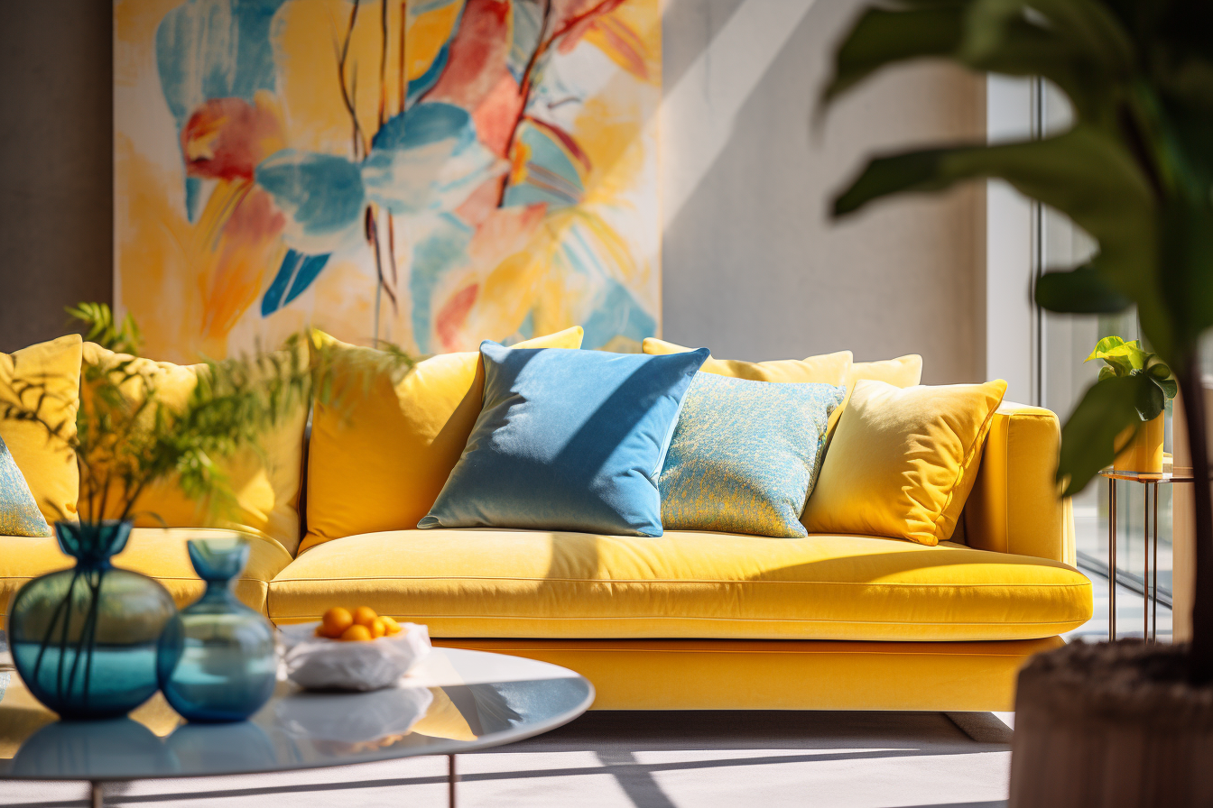
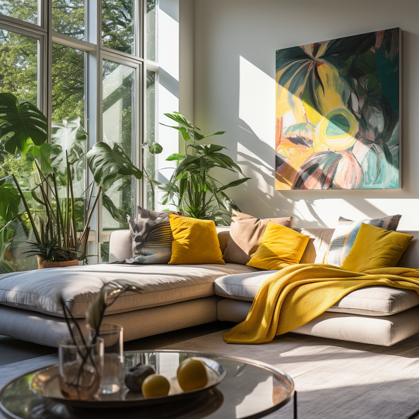
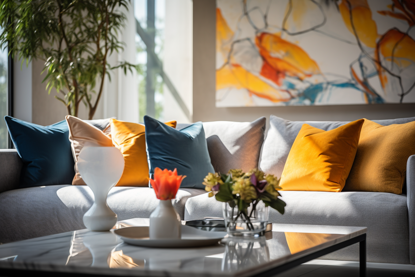
- Main Color First: See the main shade in the painting? That’s your room’s new base color. Your chosen painting can serve as a blueprint for your room’s color scheme. Begin by identifying the dominant color in the artwork – the one that stands out or covers a significant portion of the canvas. If this color matches or complements the existing base color of your interior, you’re on the right track. This forms a cohesive foundation upon which the rest of the hues can be layered.
- Find Supporting Shades: These are your accents. They’re the secondary colors in the painting. After identifying the base color from the painting, it’s time to spot the secondary shades. These are the colors that are not as dominant but play a significant role in the overall composition of the artwork. These colors can inspire choices for accent pieces within the room, helping to tie the space together.
- Decorate with These Colors:
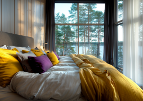
- Pillows & Throws: An easy and comfy way to introduce new shades. These are simple yet impactful elements. Choose cushions and throws in colors that echo those in your painting. They not only add comfort but also visually connect the room to the artwork.
- Curtains: Reflect art colors and enhance natural light. Curtains frame windows, and by choosing shades inspired by your painting, they can act as an extension of the artwork, thereby creating a harmonious flow.
- Decorative Objects: Vases, lamps, and trinkets can mirror the art’s hues. Select pieces that have a touch of the painting’s colors. This way, the essence of the artwork is subtly scattered throughout the space.
- Rugs: A rug can act as an anchor for the room. If you can find one that mirrors the colors in your chosen painting, it can beautifully ground the space while enhancing the overall color scheme.
- Keep It Simple: Too many colors can be distracting. Aim for harmony. While it’s tempting to incorporate every shade from the painting into the room, restraint is key. Overloading the space with too many colors can lead to visual clutter. The goal is to create a balanced and cohesive look.
- Refresh & Update: Feel free to change things up and revisit the artwork for new ideas. Tastes evolve and so can interiors. Maybe after a while, you’d like to introduce a new color or swap out some elements. The painting remains a constant source of inspiration, offering a myriad of possibilities.