My Approach to Using Color in Design
As an interior designer, one of my favorite tools is color. Turning empty rooms into comfortable, personalized spaces is my specialty, and color plays a big part in this transformation. Here’s a closer look at how and why I choose colors in my designs:
Reflecting Personalities Through Colors
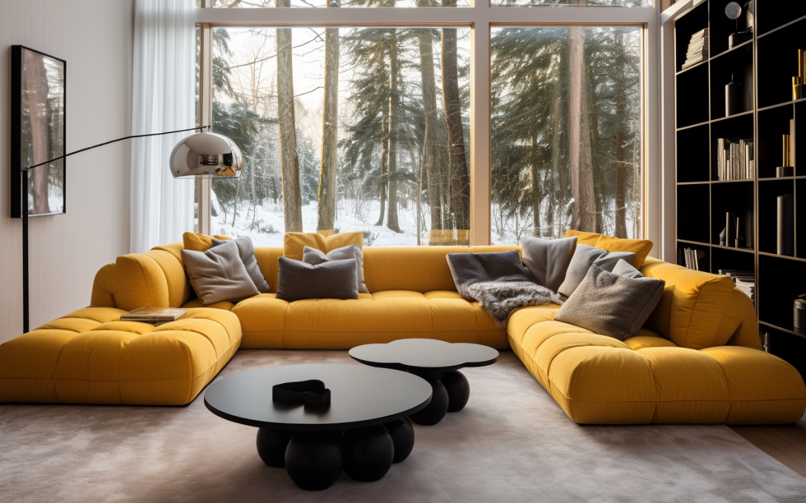
Every person is unique, and so should be the space they spend time in. When I take on a project, I think deeply about who will use that space. Will it be a young family, a single professional, or perhaps an artist? I choose colors that represent their personalities, making sure the room feels like an extension of themselves. For some, it might be calm blues, and for others, it could be vibrant yellows.
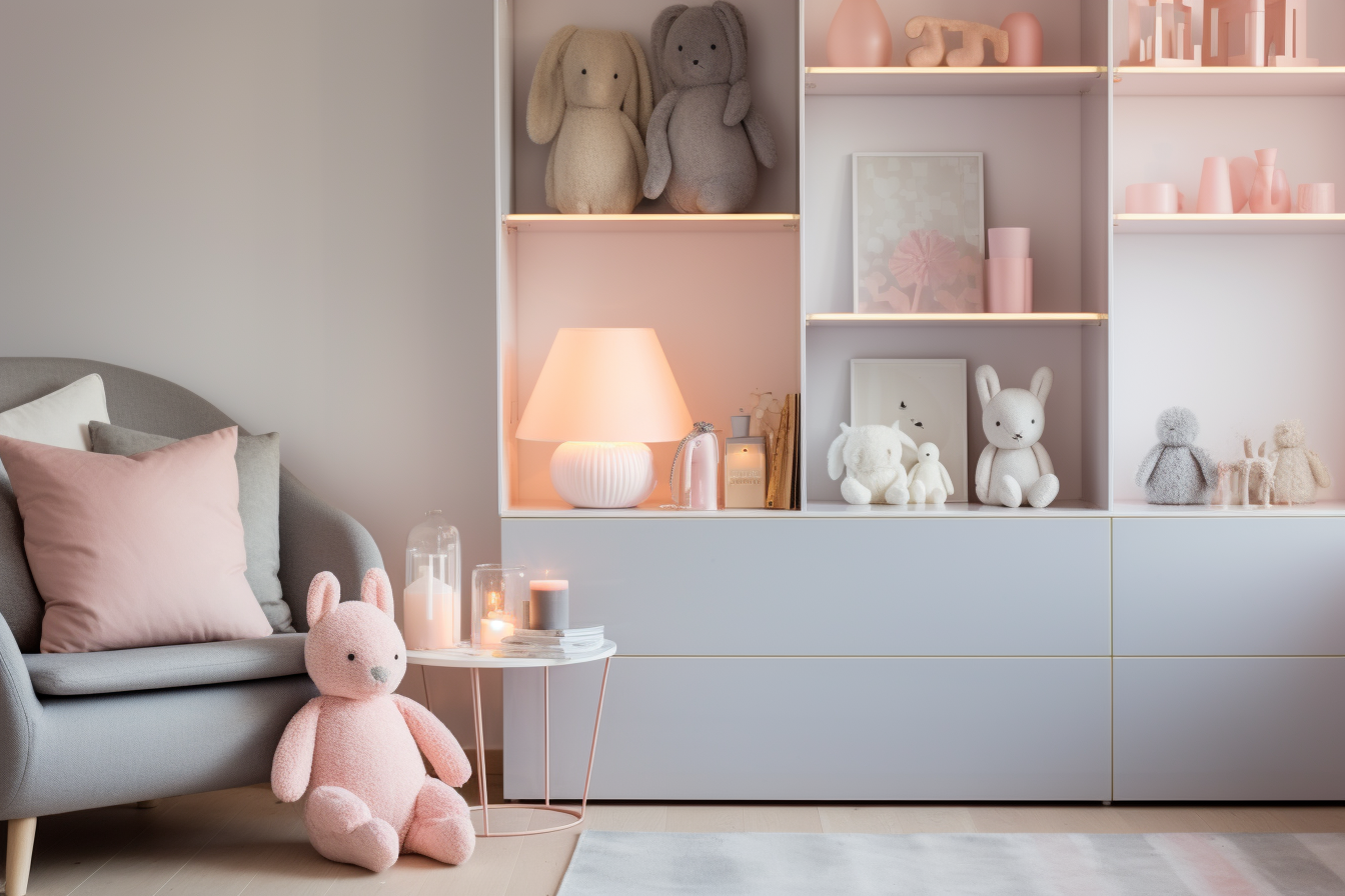
Setting the Room’s Mood
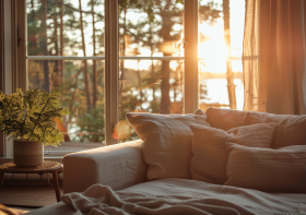
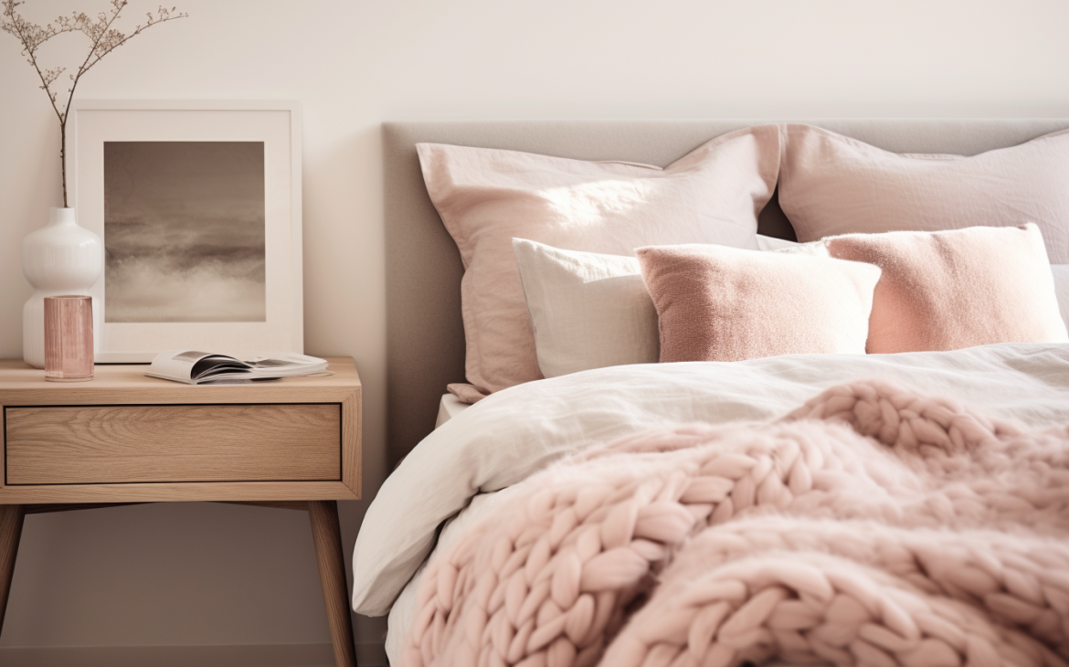
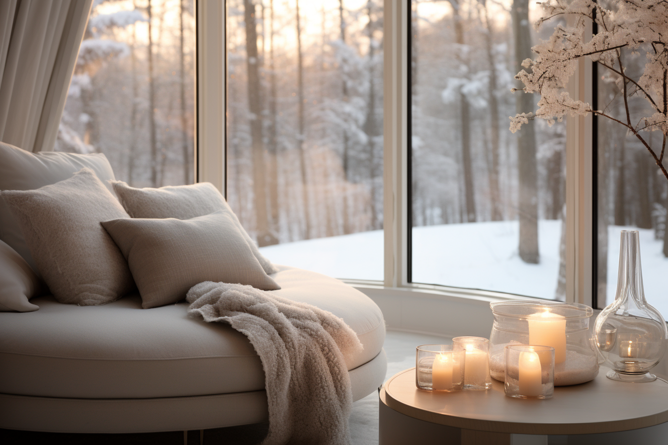
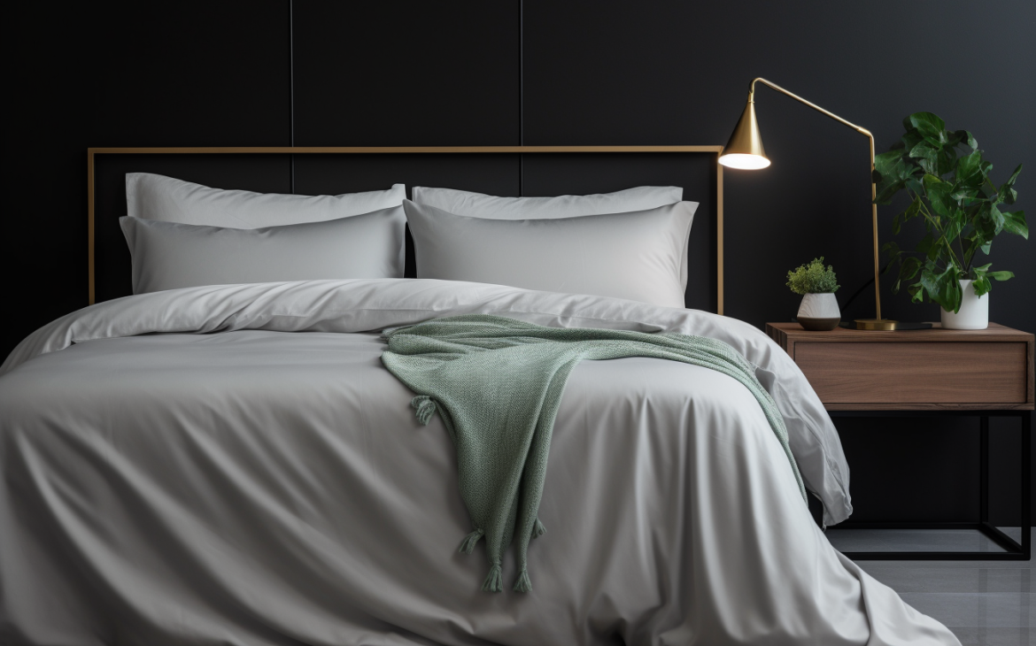
Different rooms have different purposes, and colors can set the right mood. Soft, pastel shades often make a space feel peaceful and calming, perfect for bedrooms or reading nooks. On the other hand, lively colors, like bright reds or purples, can inject energy, making them a good choice for living rooms or spaces meant for entertaining.
Manipulating Space with Color
Ever entered a room and felt it was spacious, only to realize it’s quite small? That’s the magic of color. Light hues, such as whites or light grays, can give the illusion of space, making tight areas feel more open. In contrast, deep colors like navy or chocolate can make vast spaces feel snug and intimate.
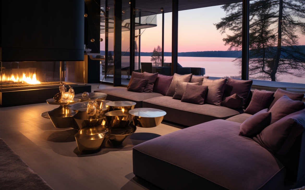
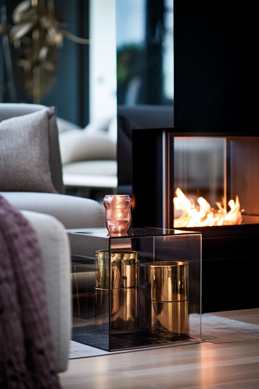
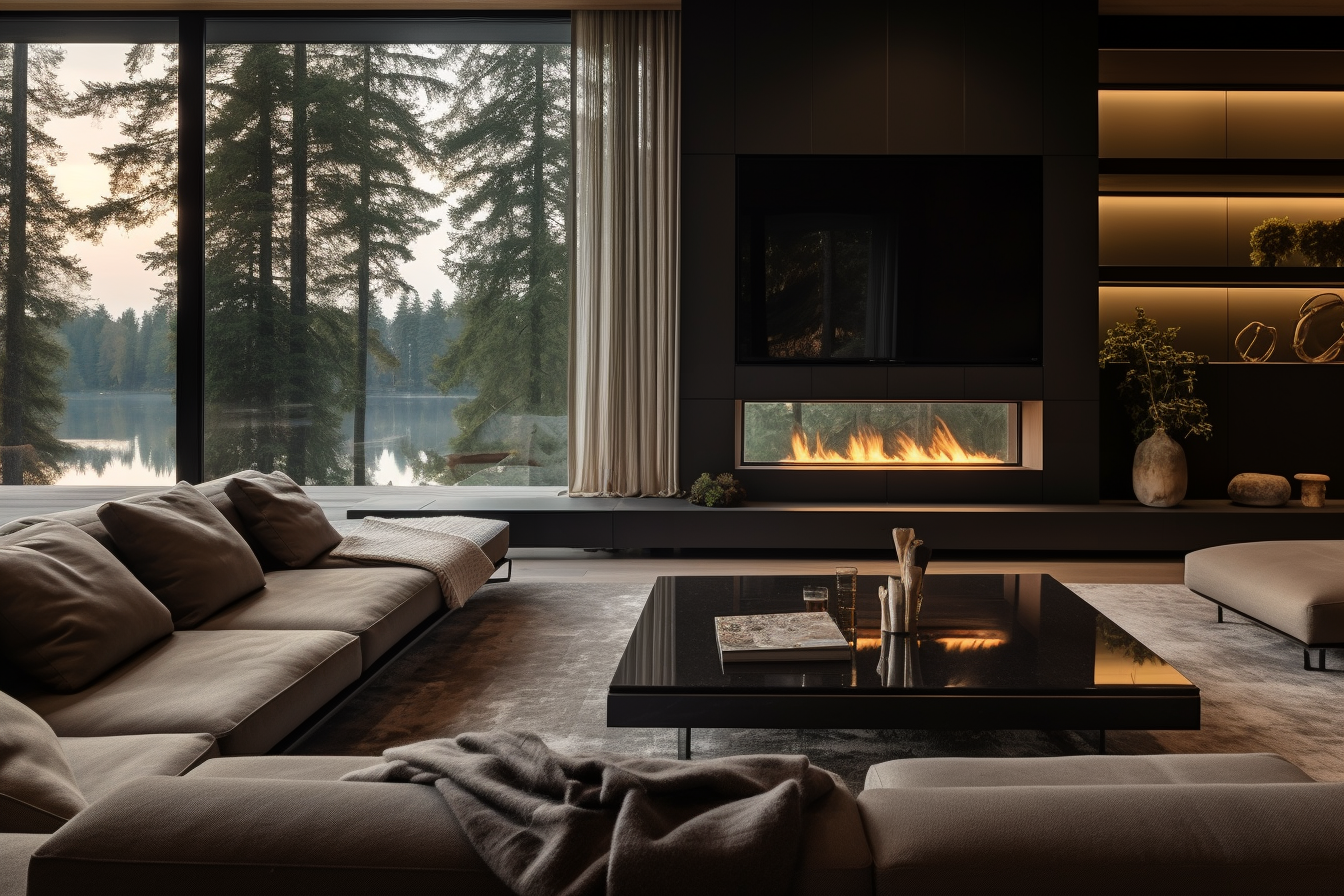
Highlighting Special Features
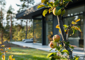
Every room has its unique features. It could be an old fireplace, a beautiful arch, or even an interesting ceiling. I love using color to draw attention to these special spots. For instance, contrasting a white wall with a dark-colored fireplace can make it the room’s centerpiece.
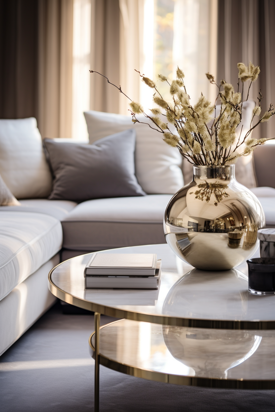
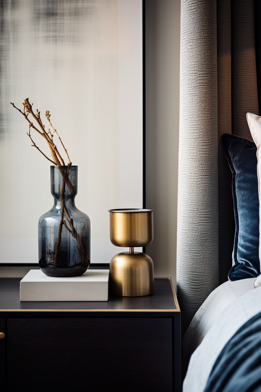
Balancing Trends and Timelessness
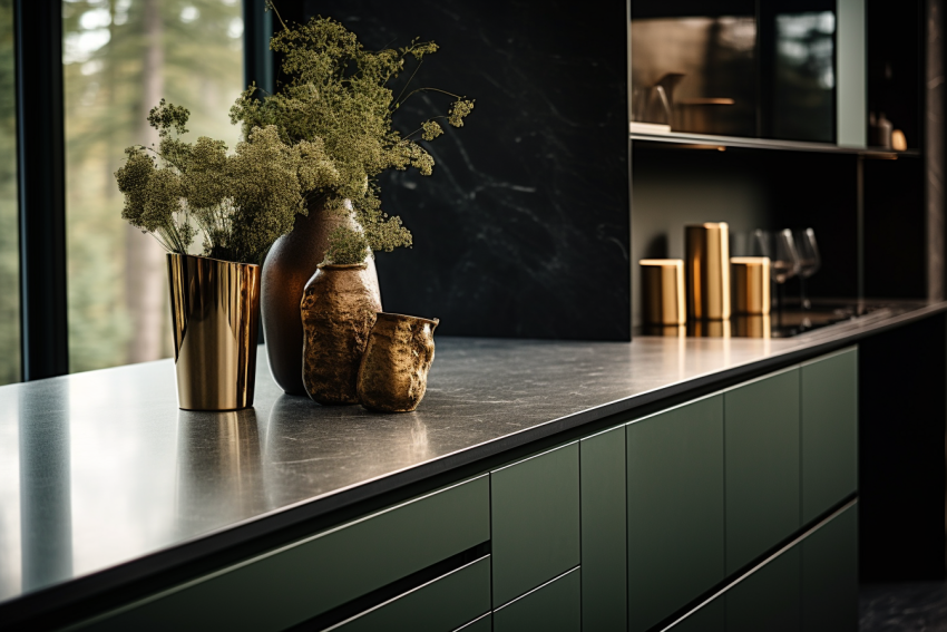
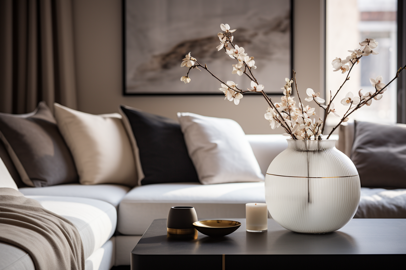
While it’s fun to play with trendy shades, it’s crucial to think long-term. What’s in today might be out tomorrow. So, I use trendy hues on smaller items like cushions or vases, ensuring the main colors remain timeless. This way, even as trends change, the room still feels fresh and modern.
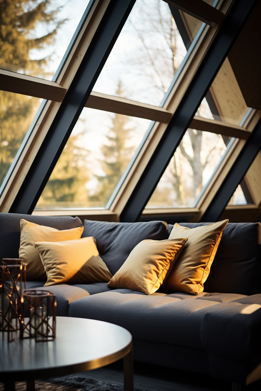
Harmony is Key
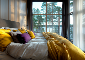
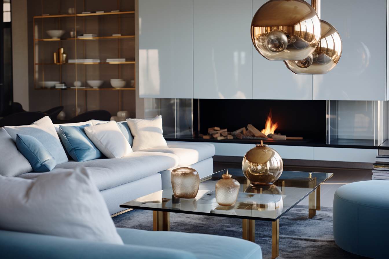
Just as in music, harmony in design creates a sense of balance. It’s not just about one color, but how all the colors in a space work together. For example, a blue sofa might be paired with gold throw pillows, creating a balance between cool and warm tones. This ensures the room feels cohesive and pleasant to be in.
In the end, my goal is to craft spaces that not only look good but also feel right for those living in them. And color is one of the most powerful tools to achieve that.
If you wan to learn more about colors buy my book Color theory in interior design from Amazon