Delving Deeper into Cool Colors: Calming and Soothing
Cool colors, situated on the opposite end of the color spectrum from warm hues, encompass various shades of blue, green, and purple. These colors are often associated with elements of nature like water, sky, and foliage, which inherently evoke feelings of calm, relaxation, and rejuvenation. They are known for their soothing and refreshing qualities, making them ideal for creating a serene and tranquil environment.
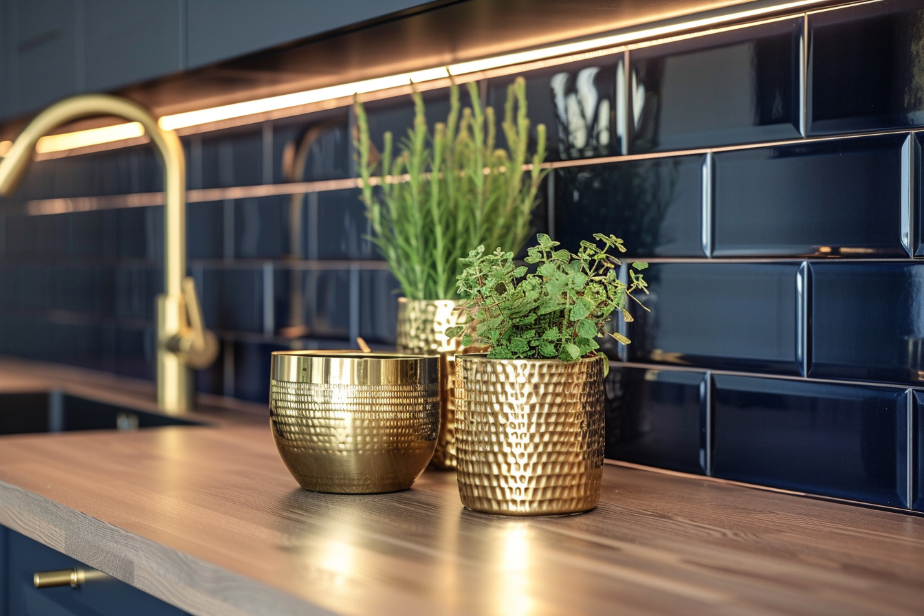
When used in interior design, cool colors can be complemented with natural elements like wood or stone to add warmth and texture, balancing the coolness of the hues. They also pair well with metallic accents like silver or chrome, which enhance their modern and sophisticated qualities.
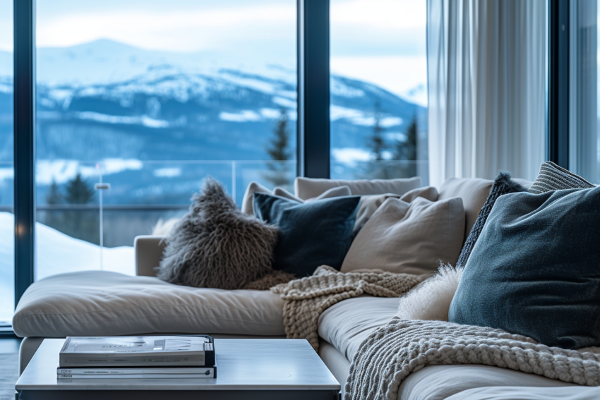
Blue: Serenity and Tranquility
Blue, frequently linked with calmness and serenity, holds a special place in color psychology for its soothing effect on the mind. This color is renowned for its ability to reduce stress and promote relaxation, making it a favored choice in environments where peace and tranquility are desired.
Lighter shades of blue, such as sky blue or aqua, are known for their refreshing and friendly appeal. These hues have the ability to create an atmosphere that is both calming and invigorating, reminiscent of a clear, sunny sky or the gentle flow of a serene river. They are ideal for spaces like bathrooms, bedrooms, or nurseries, where a peaceful yet cheerful ambiance is beneficial. In workplaces or study areas, these lighter blues can help maintain a sense of calm focus, aiding concentration and productivity.
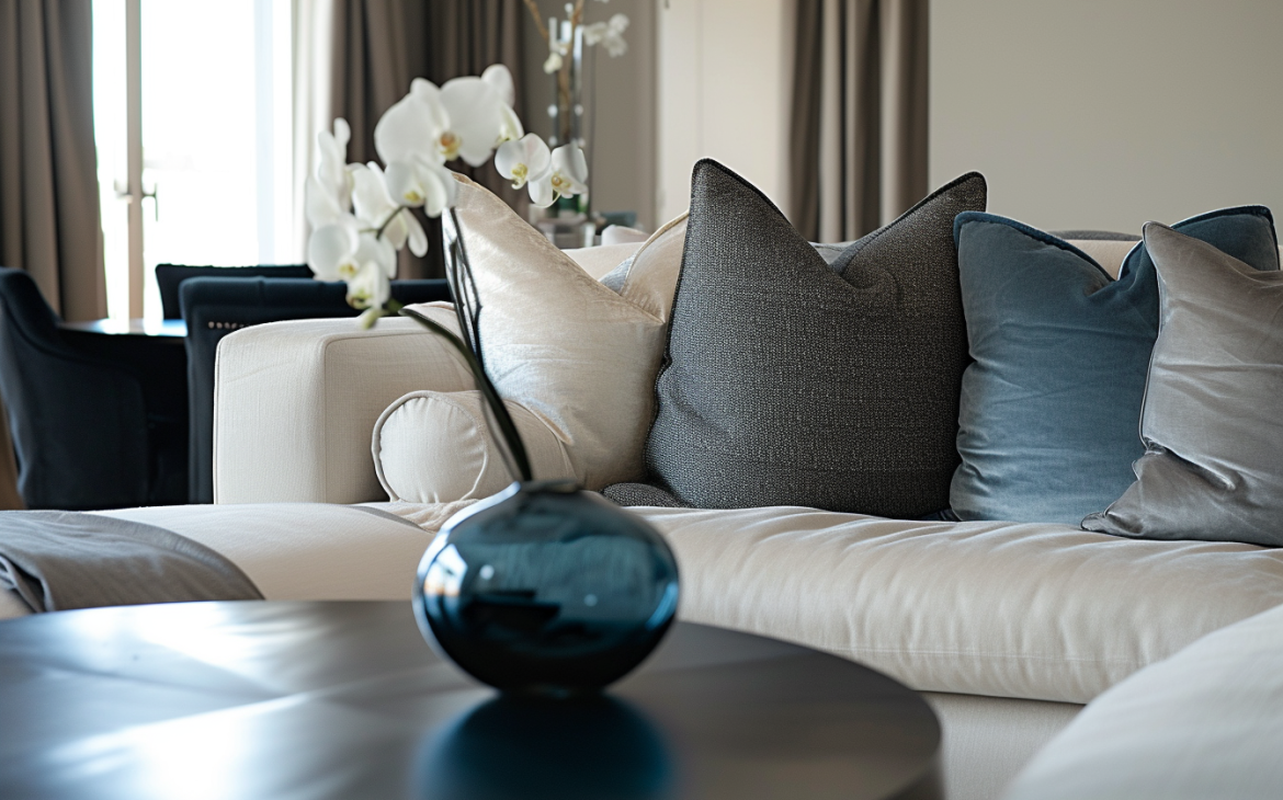
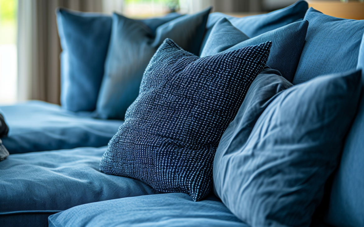
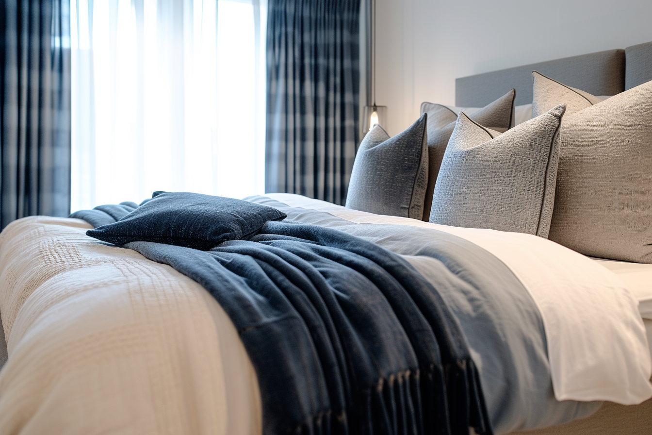
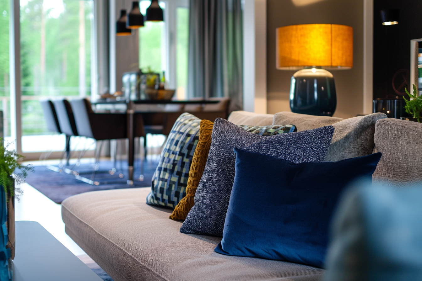
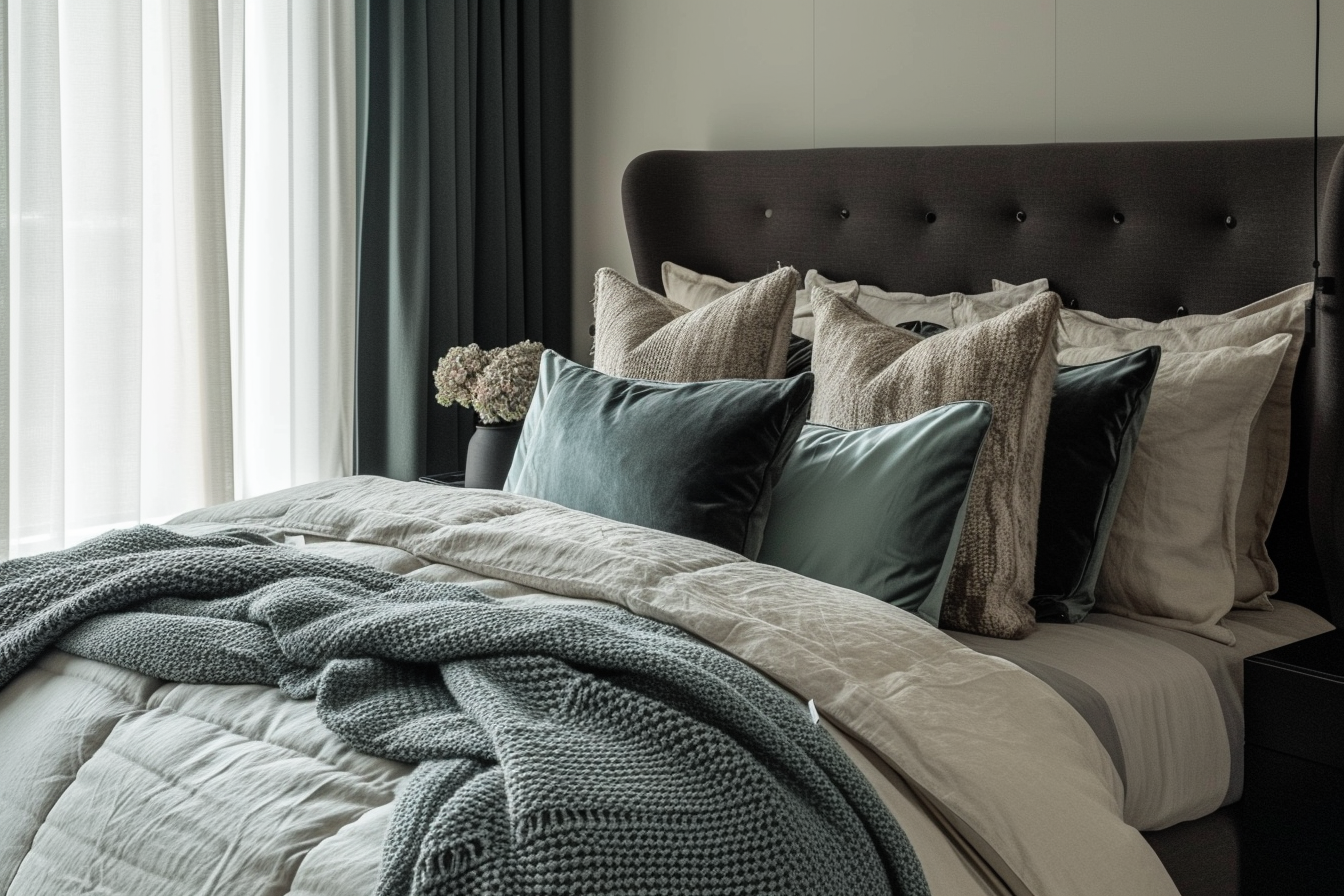
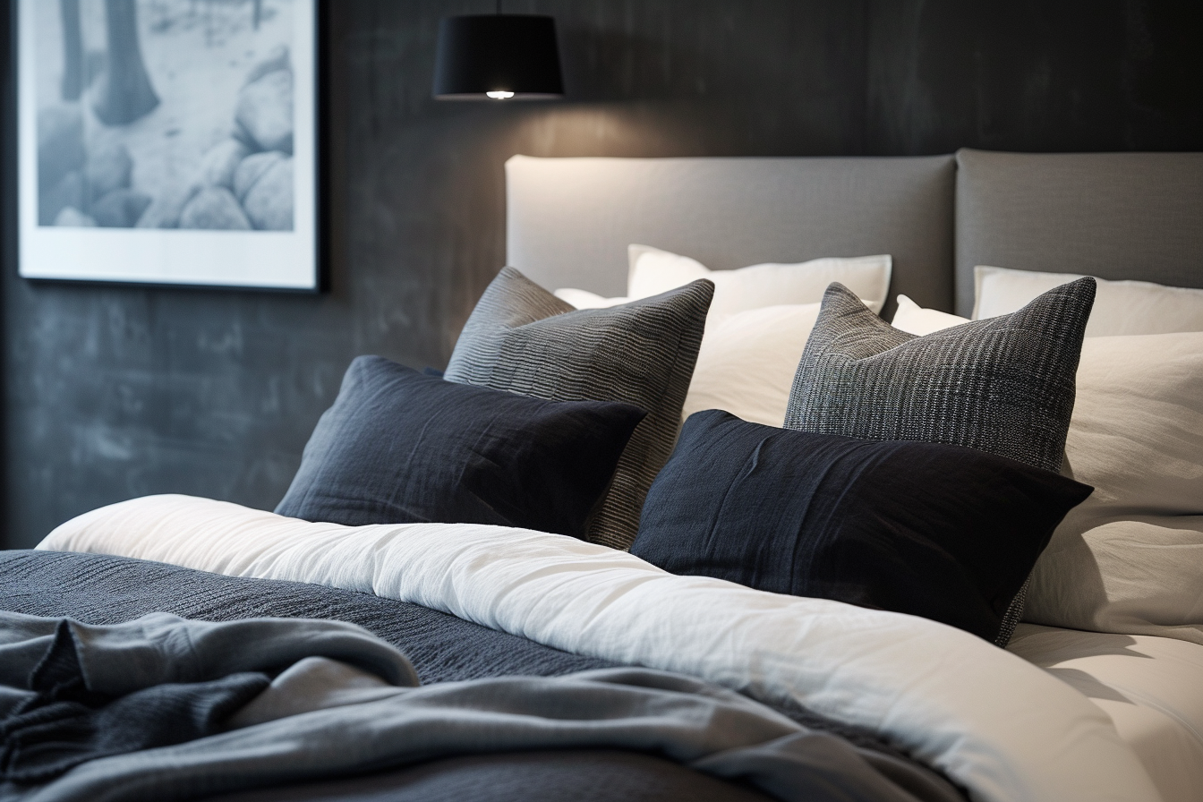
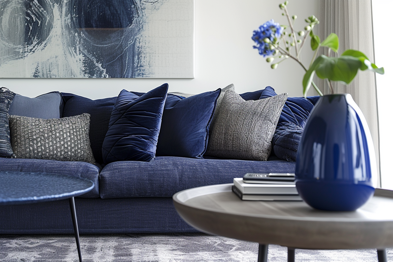
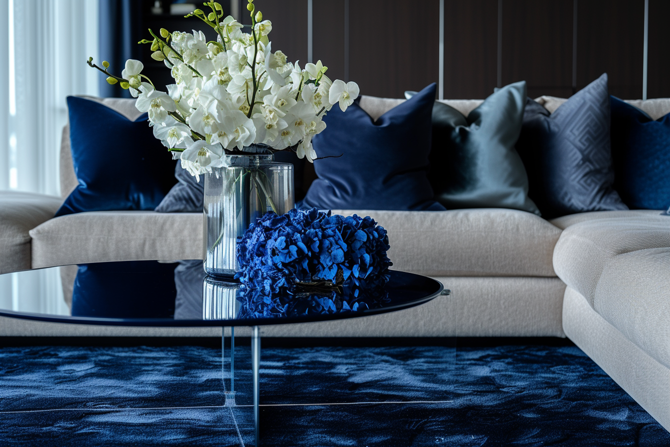
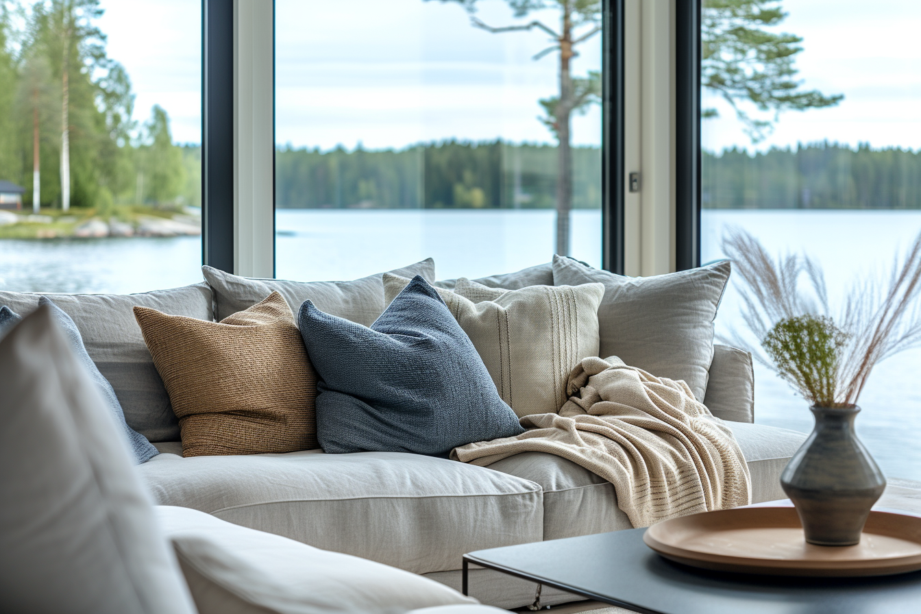
Darker shades of blue, like navy or midnight blue, convey a sense of depth and introspection. These richer blues are often perceived as more serious and contemplative, making them suitable for spaces where deeper thought and reflection are encouraged. They can add an element of sophistication and elegance to a room, often used in living rooms, dining areas, or offices. Despite their somber undertones, dark blues can still be comforting, particularly when paired with soft lighting and cozy textures.
Application in Interiors:
The versatility of blue extends beyond its various shades. In interior design, blue can be effectively combined with a range of other colors. When paired with warm neutrals or wood tones, blue can create a balanced and inviting space. Paired with crisp whites, it evokes a clean, nautical feel that is both classic and relaxing. For a more dynamic and contemporary look, blue can be paired with bright colors like yellow or orange, creating an energizing contrast.
Furthermore, the use of blue in home decor extends to accessories and furnishings. Blue pillows, rugs, curtains, and artwork can introduce this calming color into a space without the commitment of paint. In larger doses, like a blue sofa or wall, it becomes a statement piece that sets the tone for the entire room.
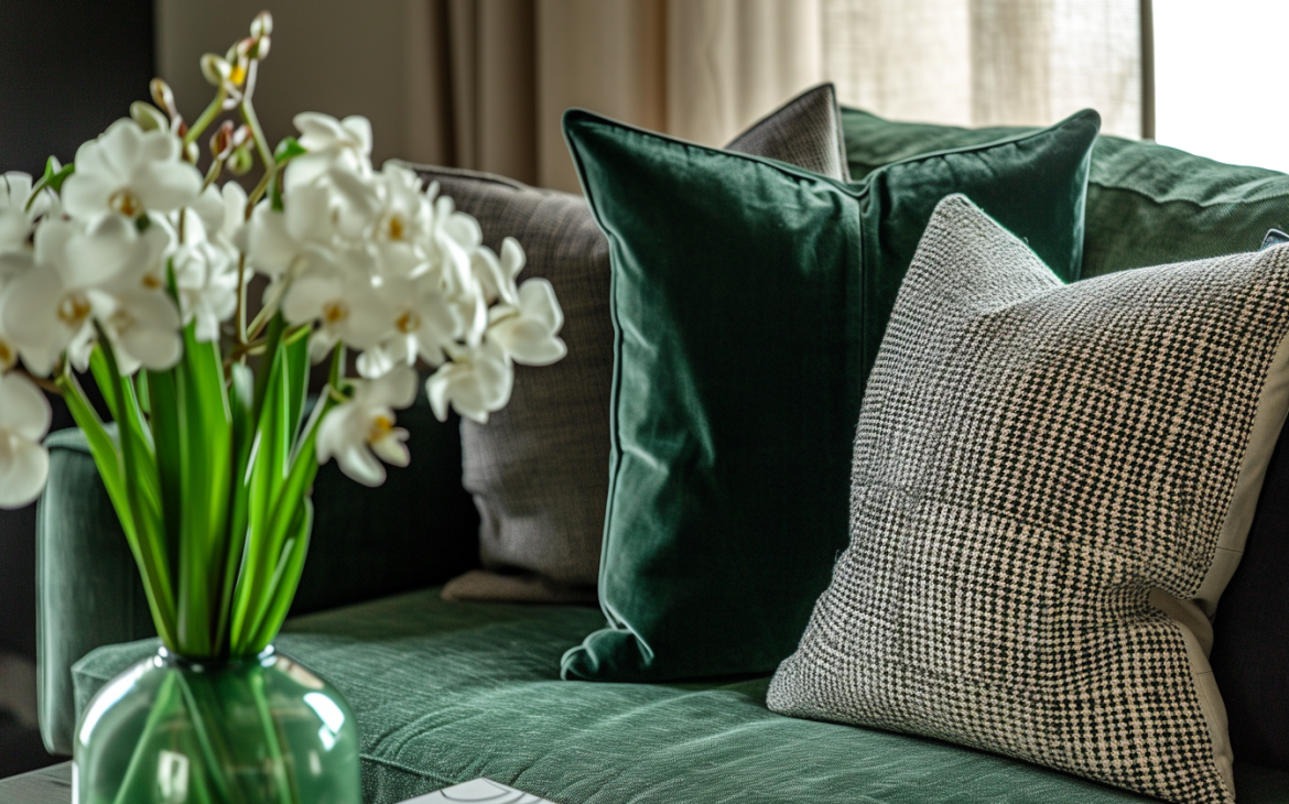
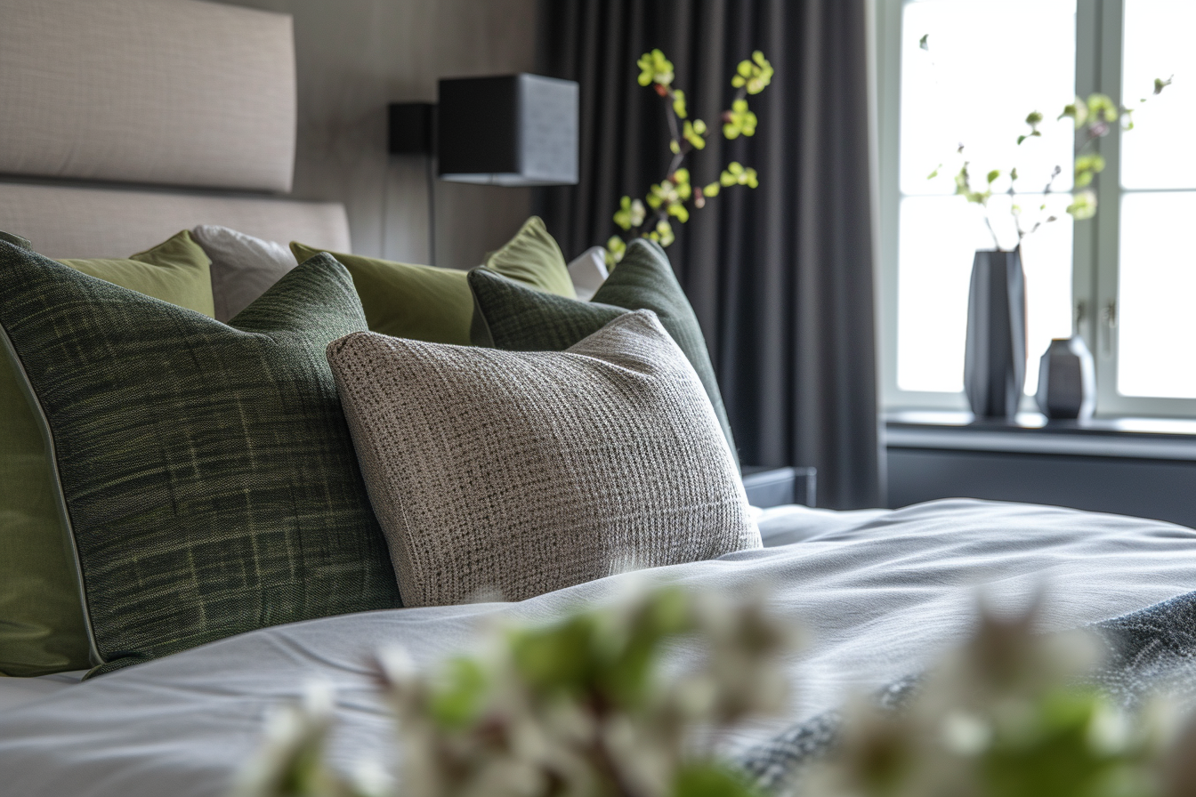
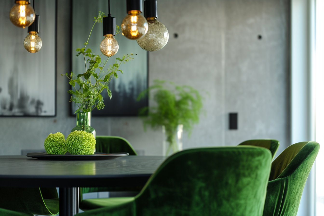
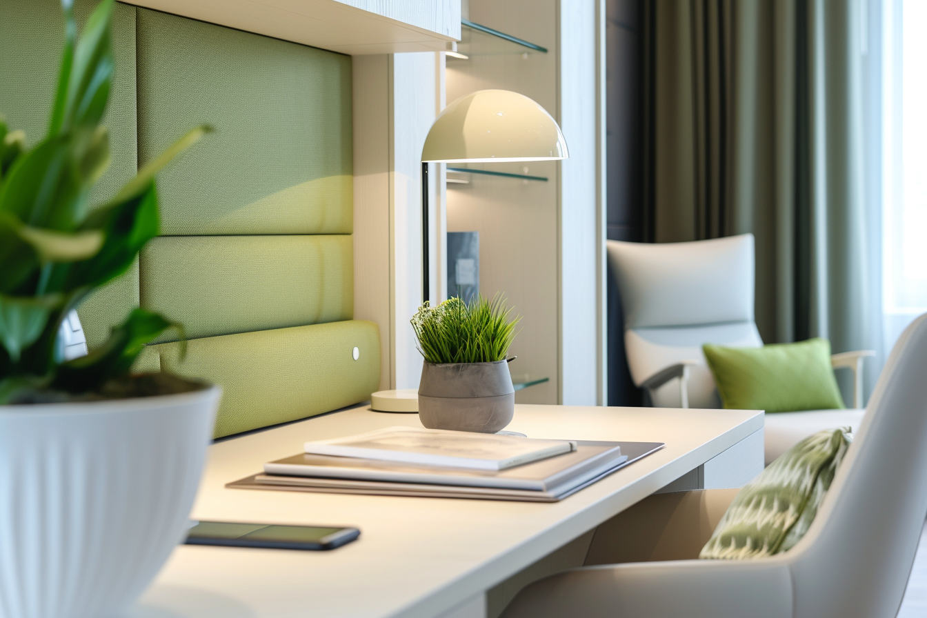
Green: Harmony and Renewal
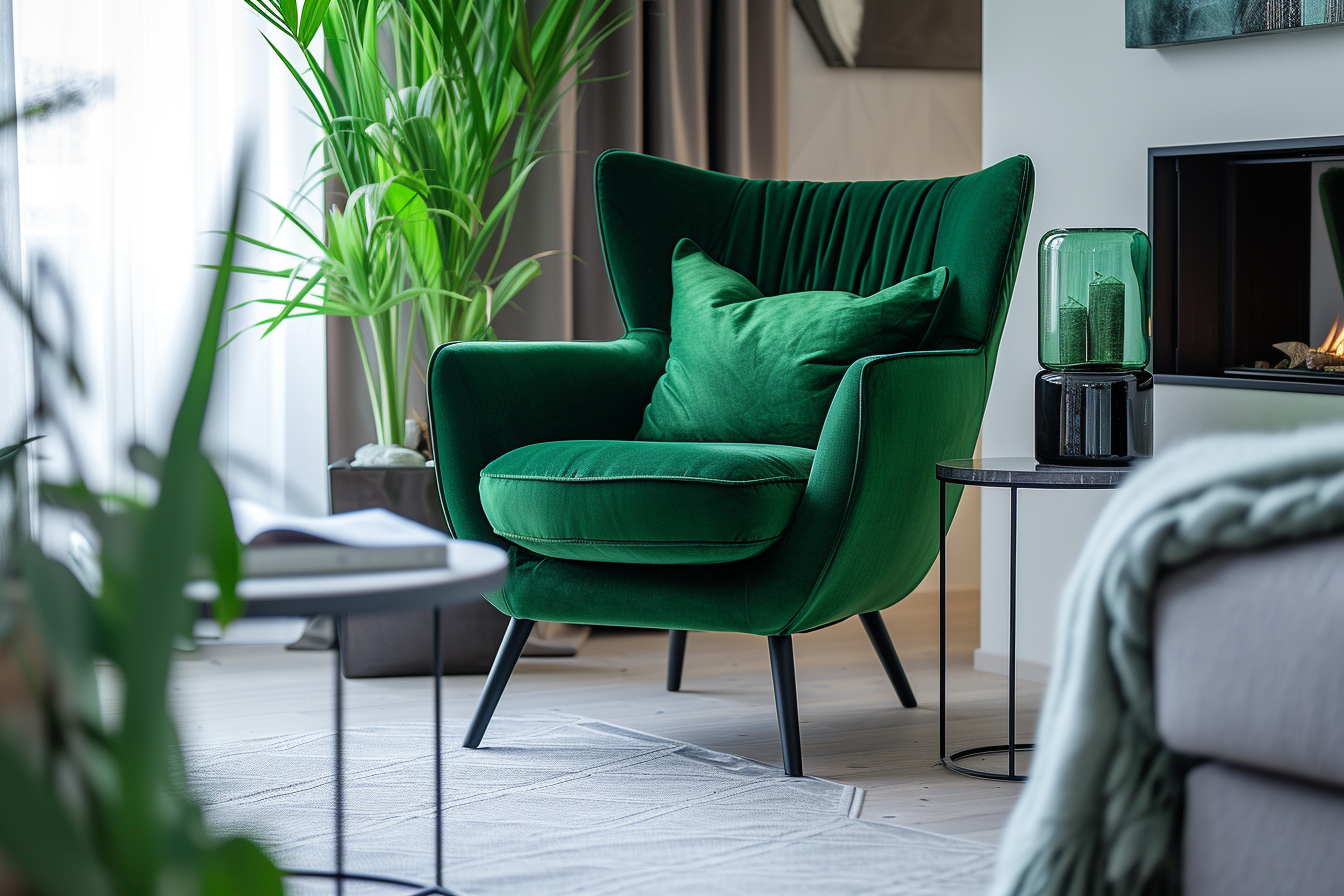
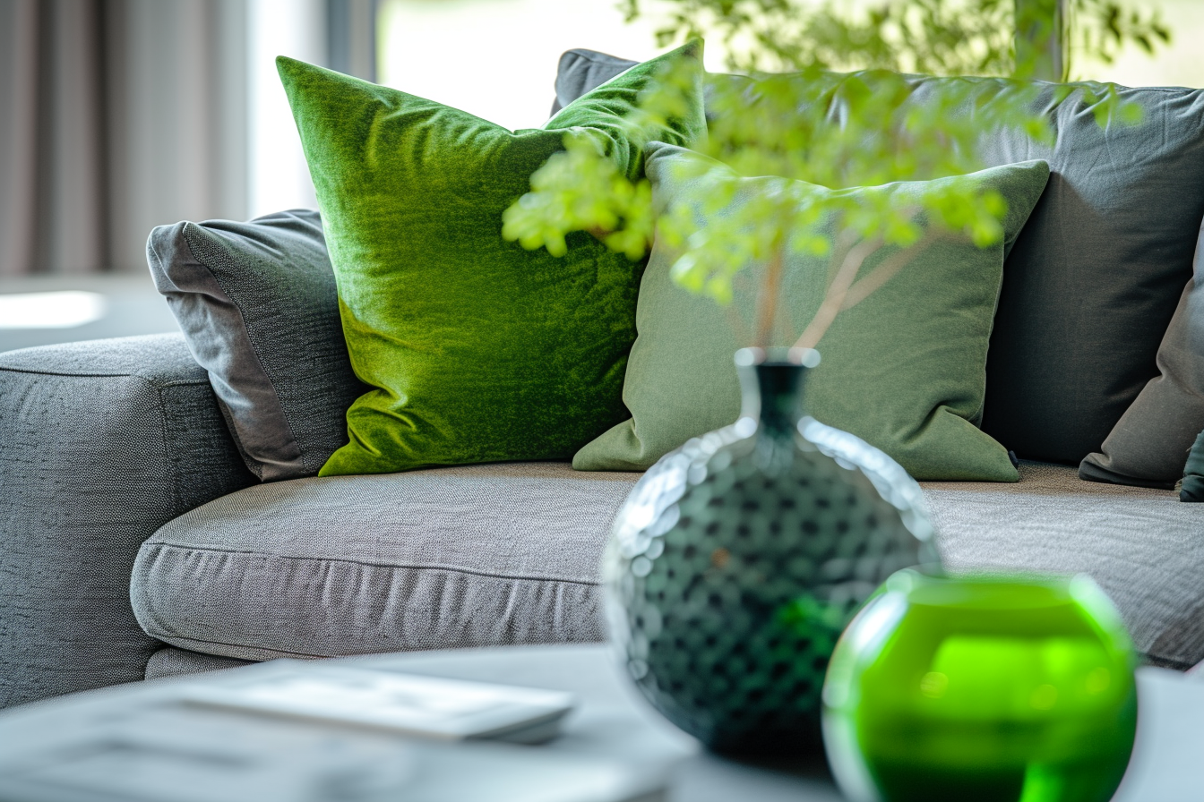
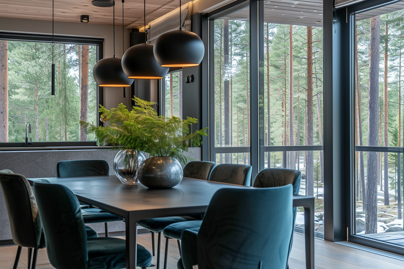
Greens are as varied as the foliage they represent, from the soft, muted tones of sage to the vibrant hues of emerald. Green is a restorative and refreshing color, often used in spaces where the goal is to create a sense of balance and harmony. It’s a color that can bring the outdoors in, promoting a sense of well-being and connection to nature. Living rooms, home offices, and kitchens can benefit from green, as it fosters a sense of renewal and vitality.
Application in Interiors:
Green, with its strong associations with nature, is a versatile color that works well in a wide range of rooms, from living rooms to kitchens to bedrooms. Its ability to evoke the outdoors makes it particularly effective in spaces where a natural, organic feel is desired. The color green, in its various shades, can bring a sense of balance, harmony, and rejuvenation to an interior space, making it a popular choice in home design.
In living rooms, green can create a calming and welcoming environment. Shades like olive or sage offer a muted, earthy feel, while brighter greens can add a more vibrant touch. Green can be incorporated through wall paint, but it also works wonderfully in the form of houseplants, which add life and clean air to the room. Green accents in throw pillows, curtains, or area rugs can also bring a touch of nature into the living space.
In kitchens, green can promote a fresh and healthy atmosphere. Lighter greens can brighten the space and give it a clean, airy feel, reminiscent of fresh produce or a spring garden.
Bedrooms benefit from green’s calming properties, making it an excellent choice for walls, bedding, or decor. Softer greens like mint or seafoam provide a restful backdrop, conducive to relaxation and sleep. In children’s bedrooms, brighter greens can create a playful and energetic environment, stimulating creativity and growth.
Beyond its aesthetic appeal, green has psychological benefits as well. It’s known to reduce stress and help people feel more relaxed and refreshed. This makes it ideal for spaces where unwinding and rejuvenation are key, such as reading nooks or home offices.
Moreover, green’s versatility allows it to pair well with a variety of other colors. It can be matched with neutrals for a subtle, earthy palette or combined with bolder colors for a more dynamic look. In modern design, pairing green with unexpected colors like pink or black can create a contemporary and chic space.
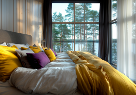
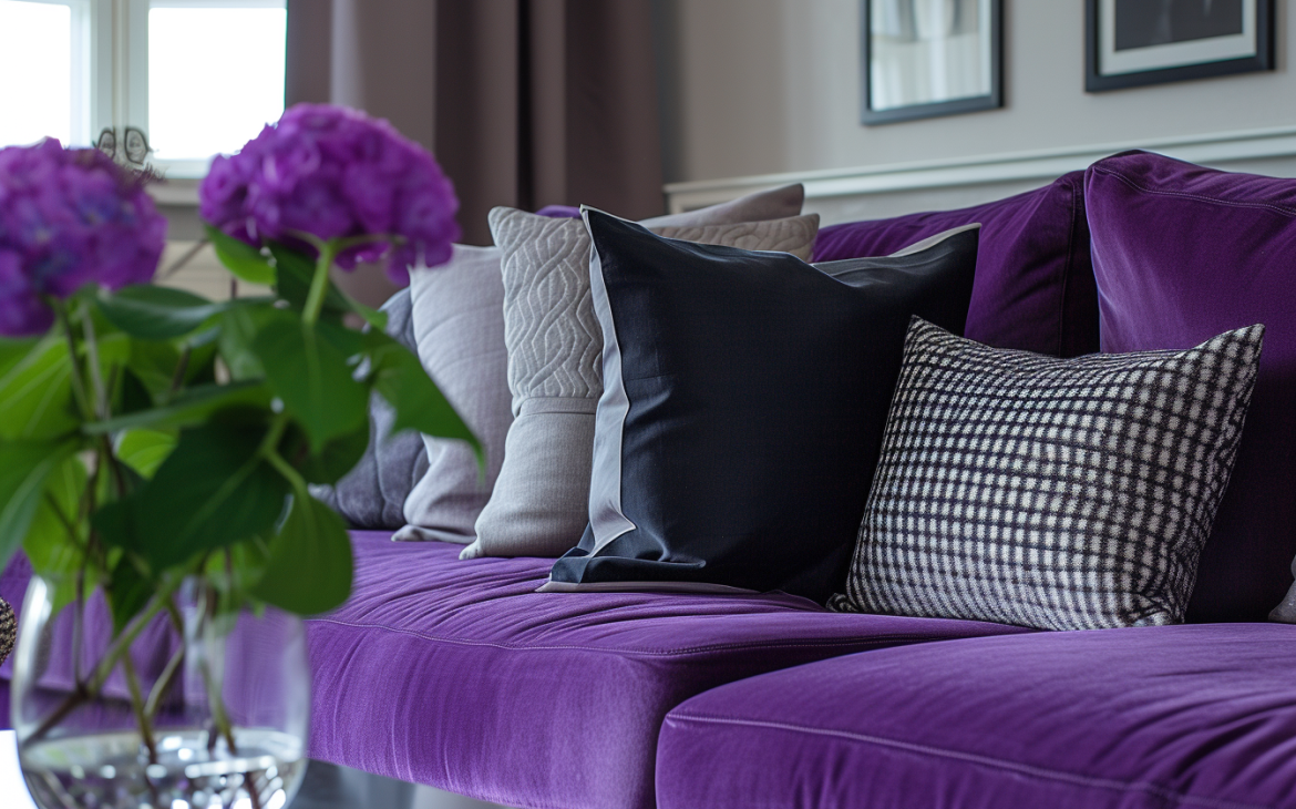
Purple: Creativity and Luxury
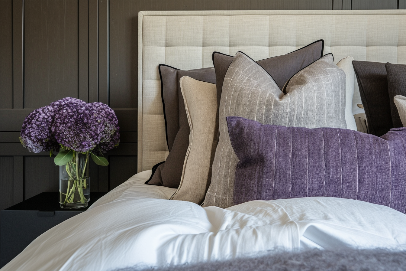
Purple, a unique blend of calming blue and energetic red, offers a spectrum of hues that can inspire creativity, luxury, and spirituality. This color has a rich history and is often associated with royalty, nobility, and prestige. Its various shades, from the lightest lavenders to the deepest plums, provide a wide range of options for different moods and settings.
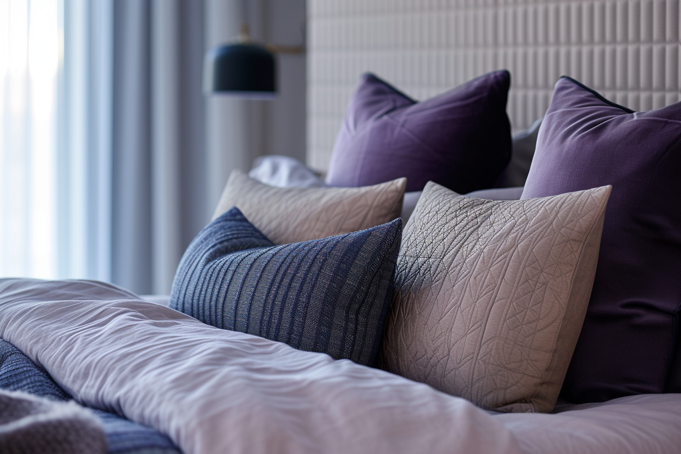
Lighter purples, such as lavender, are known for their restful and soothing qualities. These softer shades are excellent for creating a tranquil and relaxing atmosphere, making them ideal for bedrooms, bathrooms, or any space where relaxation is a priority. Lavender can help reduce anxiety and stress, promoting a sense of calm and well-being. It’s also a popular choice in nurseries and children’s rooms, as it’s gentle and conducive to peaceful sleep.
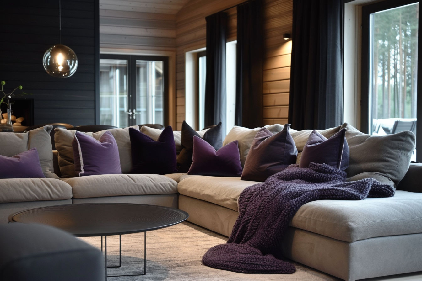
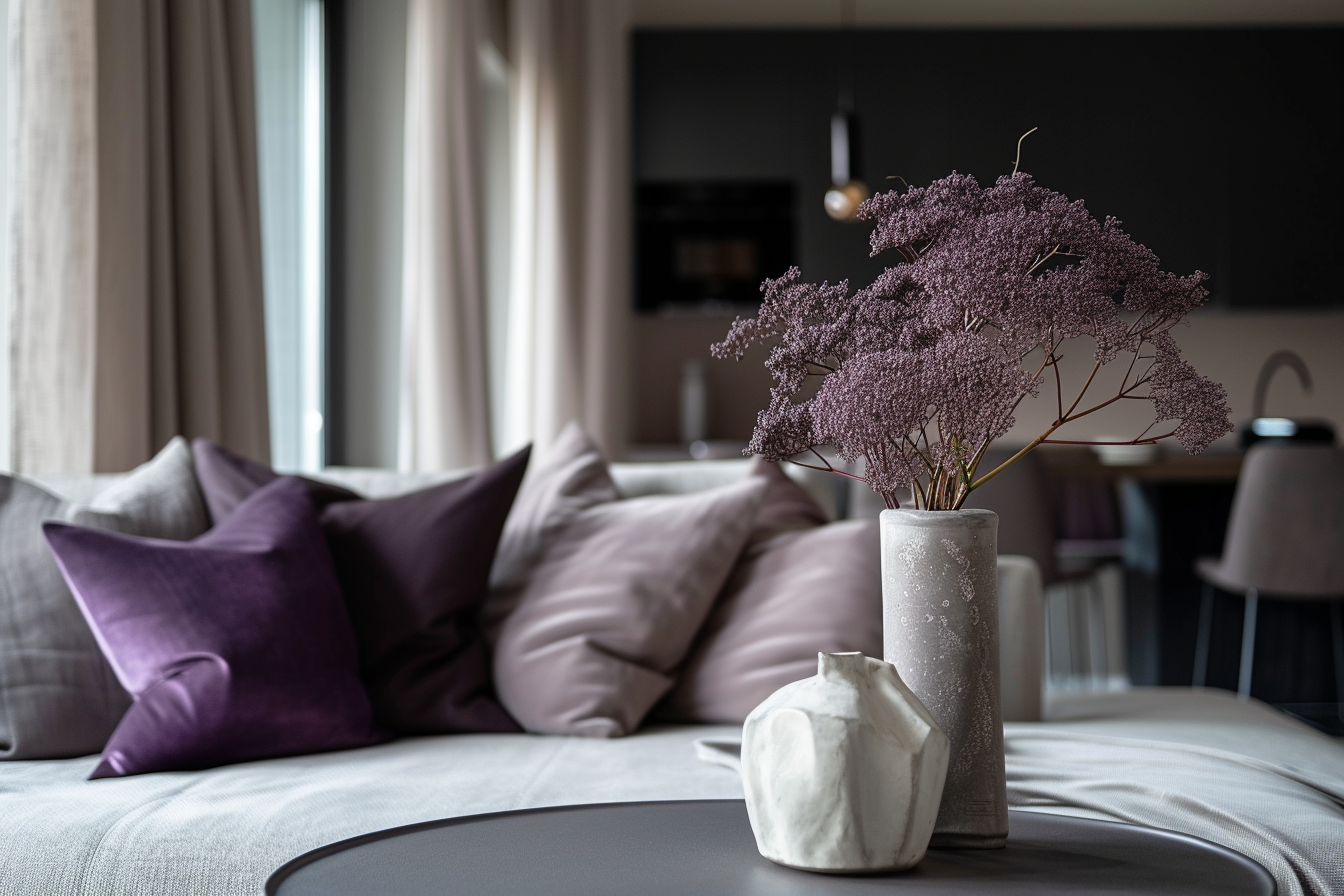
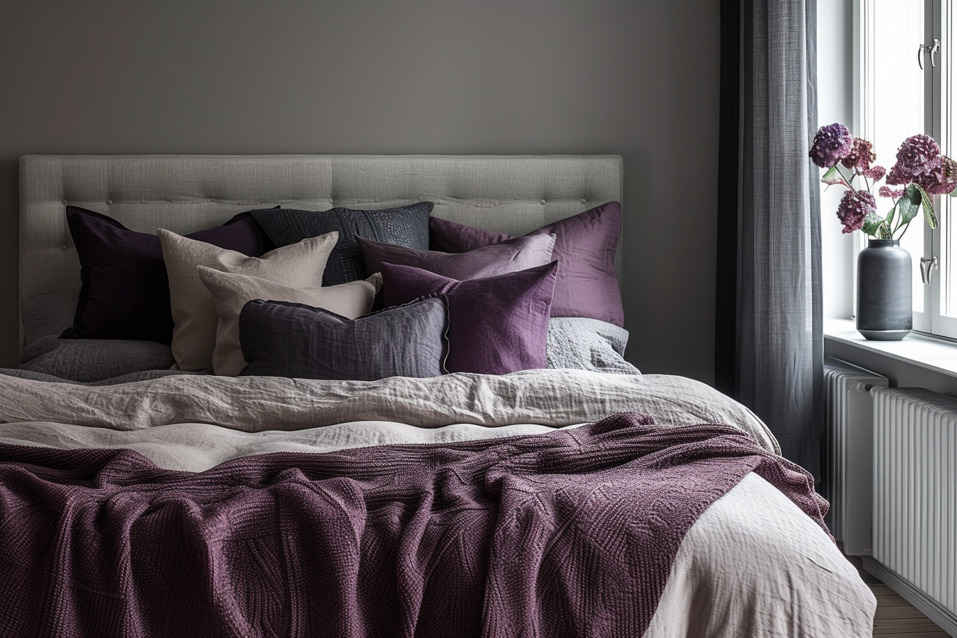
Deeper purples, like eggplant or royal purple, exude a sense of sophistication and depth. These richer tones are perfect for creating an ambiance of luxury and elegance. They work well in formal living rooms, dining rooms, or as accent colors in an otherwise neutral palette. Deep purple can make a bold statement when used on a feature wall, in a piece of furniture, or in heavy drapes. It pairs beautifully with metallic accents like gold or silver, enhancing its luxurious feel.
Application in Interiors:
Lighter purples, such as lilac and lavender, are perfect for creating serene and tranquil environments, making them ideal choices for bedrooms and meditation spaces. In bedrooms, these soothing shades can contribute to a restful atmosphere, aiding in relaxation and sleep. Their calming effect is conducive to unwinding after a busy day, offering a peaceful retreat. In meditation spaces or areas designated for relaxation and reflection, lighter purples can enhance the sense of peace and serenity. These hues are thought to encourage mental balance and spiritual growth, making them fitting for spaces dedicated to mindfulness practices.
In contrast, darker shades of purple, like plum or aubergine, can bring a sense of luxury and drama to more social and communal areas such as living rooms or dining areas. In living rooms, dark purple can create a rich and sophisticated backdrop, especially when used on a feature wall or in statement pieces of furniture. It pairs beautifully with plush fabrics and reflective surfaces, adding depth and luxury to the space.
In dining areas, darker purples can set a tone of elegance and formality. These hues can be used in table settings, chair upholstery, or curtains to create a dining experience that feels special and refined. When paired with proper lighting, darker purples can create an ambiance that is both cozy and opulent, ideal for dinner parties and gatherings.
Both lighter and darker purples offer great flexibility in terms of design and can be paired with a variety of textures and materials to enhance their impact. Lighter purples work well with light woods, linens, and softer textures to maintain a relaxed and airy feel. Darker purples, on the other hand, can be complemented with dark woods, leather, and heavier textiles like velvet to emphasize a sense of decadence and luxury.
Incorporating Cool Colors into Home Decor:
Incorporating cool colors into home decor is a fantastic way to create a serene, balanced, and visually appealing environment. Cool colors, which include shades of blue, green, and purple, are reminiscent of natural elements like the sky, water, and foliage. These hues are known for their calming and soothing properties, making them ideal for crafting a tranquil and refreshing living space.
The first step in incorporating cool colors is selecting the right shade that suits your space and personal style. Lighter shades like sky blue, mint green, and lavender can create a soft, serene atmosphere, while deeper tones like navy, emerald, and plum add a touch of sophistication and depth. Consider the size of the room, the amount of natural light it receives, and the existing decor when choosing your colors.
One of the most impactful ways to use cool colors is on the walls. Painting a room in a cool hue can transform the ambiance completely. For a bold statement, choose a rich, deep color for a feature wall. For a more subdued look, opt for lighter, softer shades for the entire room.
Incorporating cool colors through furniture and upholstery is another effective way to bring these tones into your home. A navy sofa, emerald green armchair, or a set of purple dining chairs can serve as a focal point in any room. If you prefer a more subtle approach, consider cool-colored throws, cushions, or slipcovers.
Textiles like rugs, curtains, and bed linens are excellent for introducing cool colors into your space. A blue rug can ground a room with a calming presence, while green curtains can bring a sense of nature and freshness. Purple bed linens can add a touch of luxury and comfort to your bedroom.
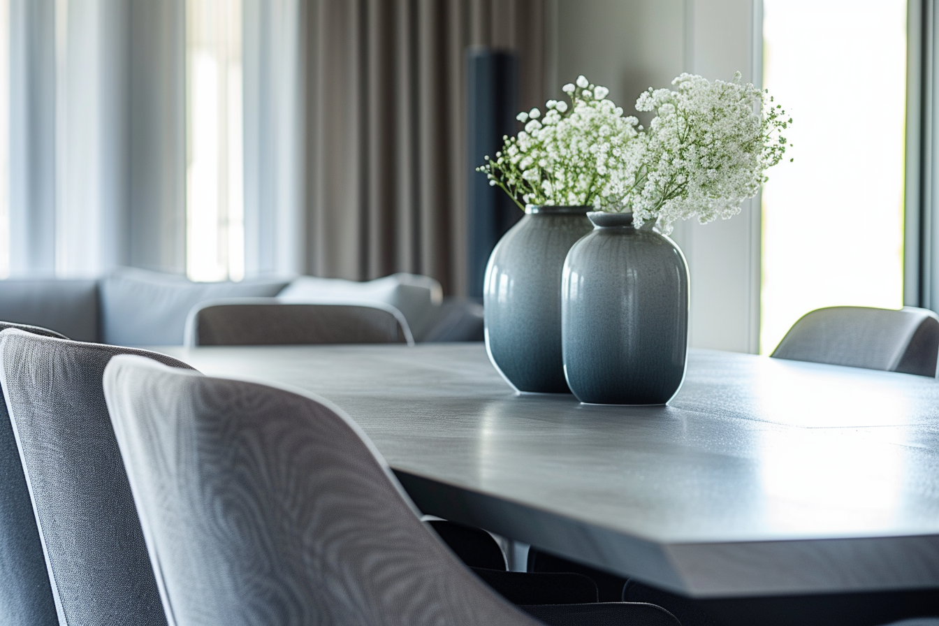
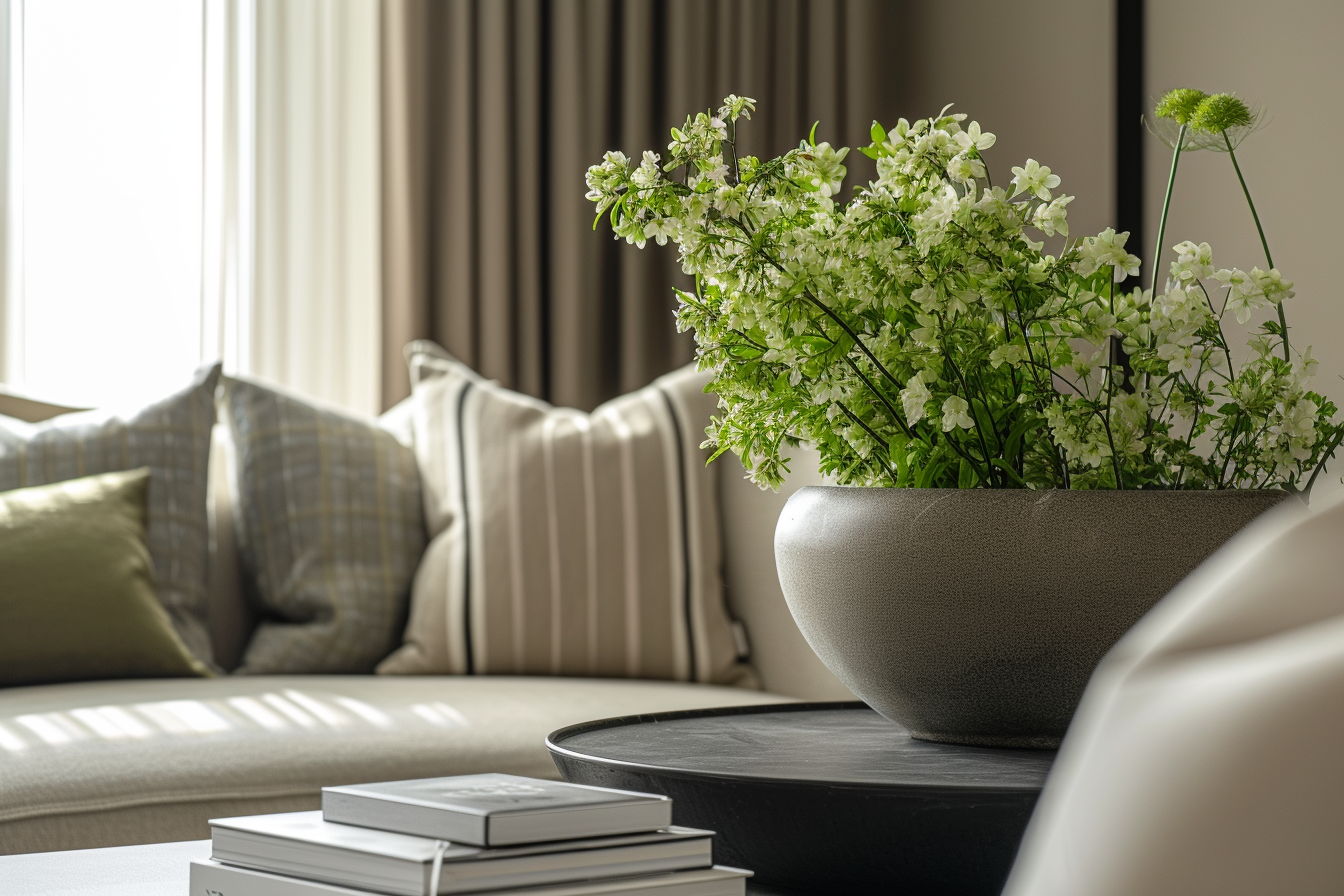
Artwork, throw pillows, vases, and lamps in cool tones can add splashes of color without overwhelming the space. These can be easily changed or rearranged, offering flexibility in your decor. Art pieces featuring cool color palettes can also set the tone and mood of the room.
Cool colors pair beautifully with neutral tones like white, grey, and beige, which can balance the coolness and create a harmonious look. They also work well with metallic accents such as silver, chrome, or brushed nickel, adding a modern touch to the decor.
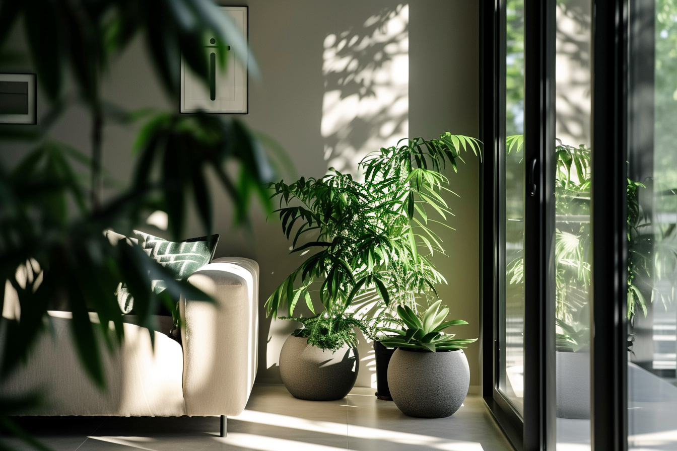
Since cool colors are often associated with the outdoors, incorporating natural elements like plants or water features can enhance the calming effect. Indoor plants in green hues, or a small indoor fountain, can tie the room’s aesthetic to nature, amplifying the tranquility of the cool color scheme.
The right lighting can enhance the beauty of cool colors. Natural light brings out their truest hues, while artificial lighting can be used to create different moods. Soft, warm lighting can make blue and green tones feel cozier, while brighter, cooler light can highlight their freshness and vibrancy.
Incorporating cool colors into your home decor is not only about aesthetic appeal but also about creating a space that feels calm, balanced, and inviting. Whether you prefer a bold splash of color or subtle hints of cool tones, there are numerous ways to integrate these hues into your home, making it a personalized and serene sanctuary.
RELATED: How Different Colors Influence Mood and Ambiance in Your Home
Exploring Warm Colors: The Energizing Palette of Your Home
If you want to learn more about the colors in Interior design, buy my book Color theory in interior design from Amazon.