Exploring Warm Colors: The Energizing Palette of Your Home
Warm colors, often associated with sunlight and heat, comprise hues from the red, orange, and yellow families. These colors evoke feelings of warmth and comfort and are known for their ability to energize and invigorate spaces.
In interior design, warm colors are frequently employed to make large, open spaces feel more intimate and inviting. They can also be used effectively in north-facing rooms to counteract the cooler light.
Warm colors are often associated with positive emotions and experiences. Reds can evoke feelings of passion and excitement, while oranges are associated with creativity and enthusiasm. Yellows, the brightest of the warm colors, are often linked to happiness and optimism. These psychological associations make warm colors a powerful tool in both art and design, capable of altering the mood and atmosphere of a space or a piece of work.
Red: Passion and Energy
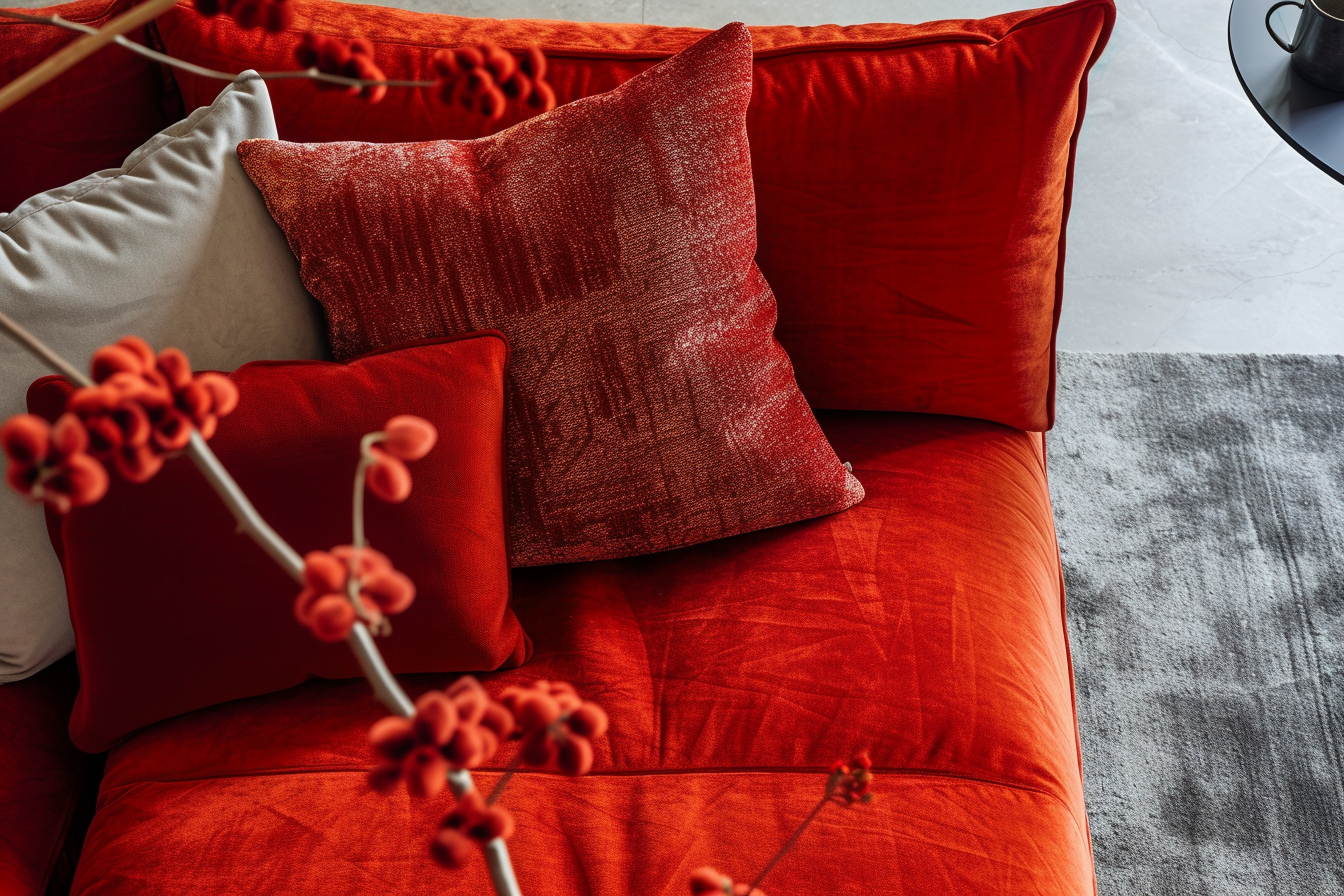
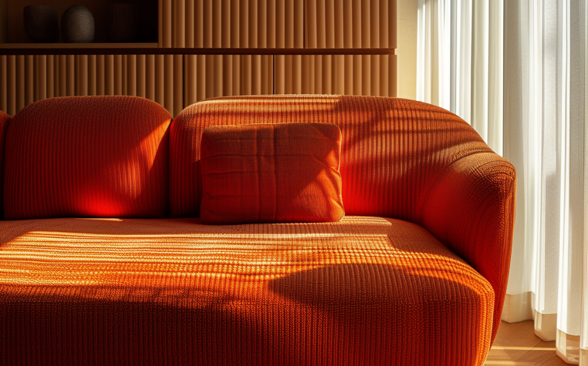
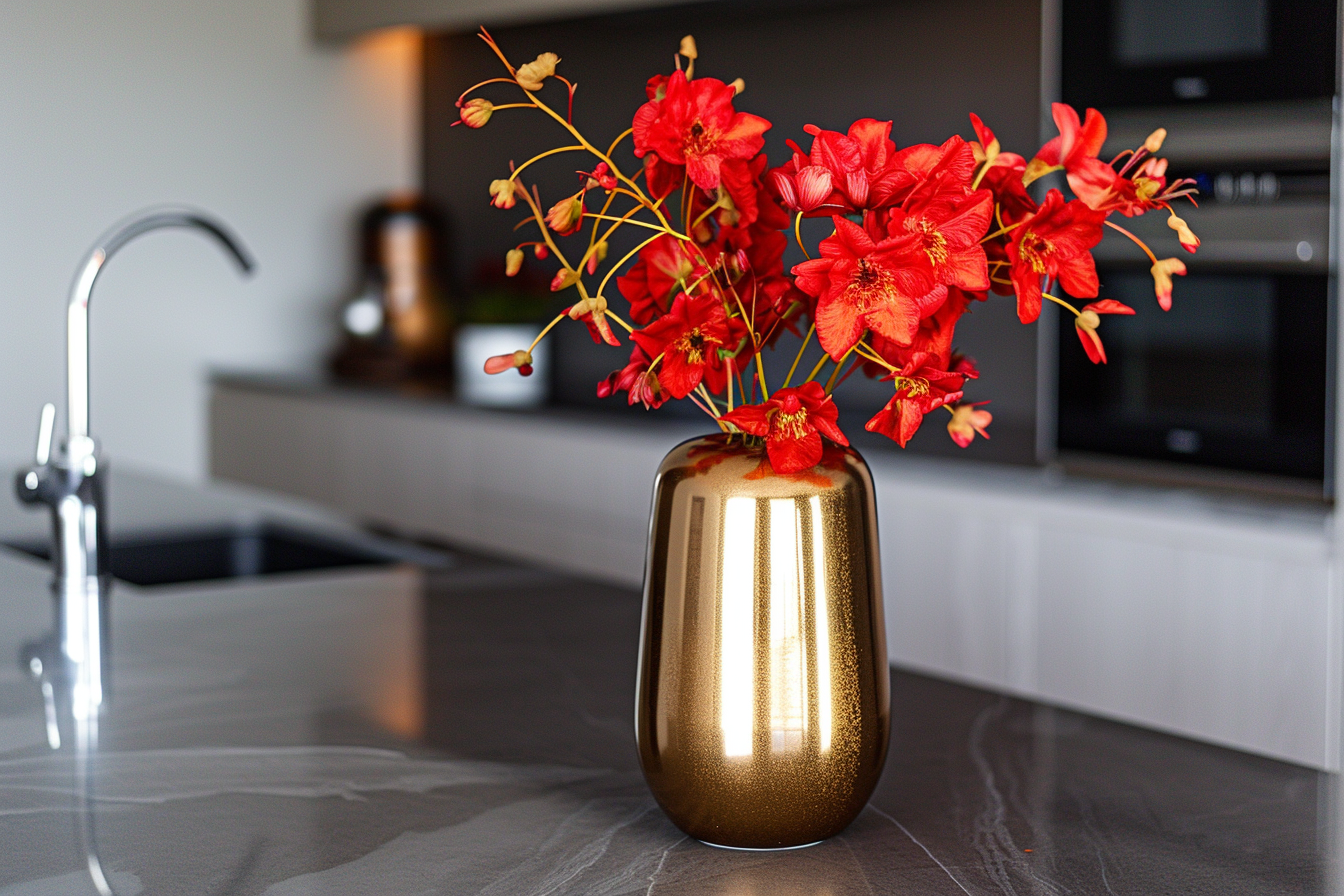
Red, the color of fire and blood, is associated with strong emotions such as love, warmth, and passion. It’s an intense color that can stimulate a faster heartbeat and breathing, making it a dynamic and energizing choice.
In interior design, red can create a sense of warmth and richness. When used in moderation, it can add depth and energy to a space. However, due to its intensity, it’s often balanced with neutral or cool tones to ensure it doesn’t overwhelm.
Application in Interiors:
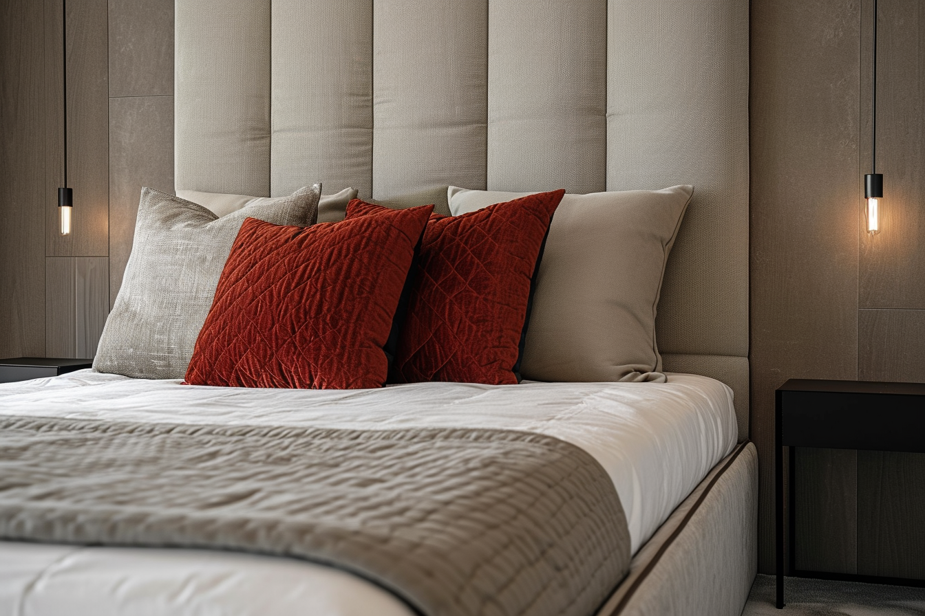
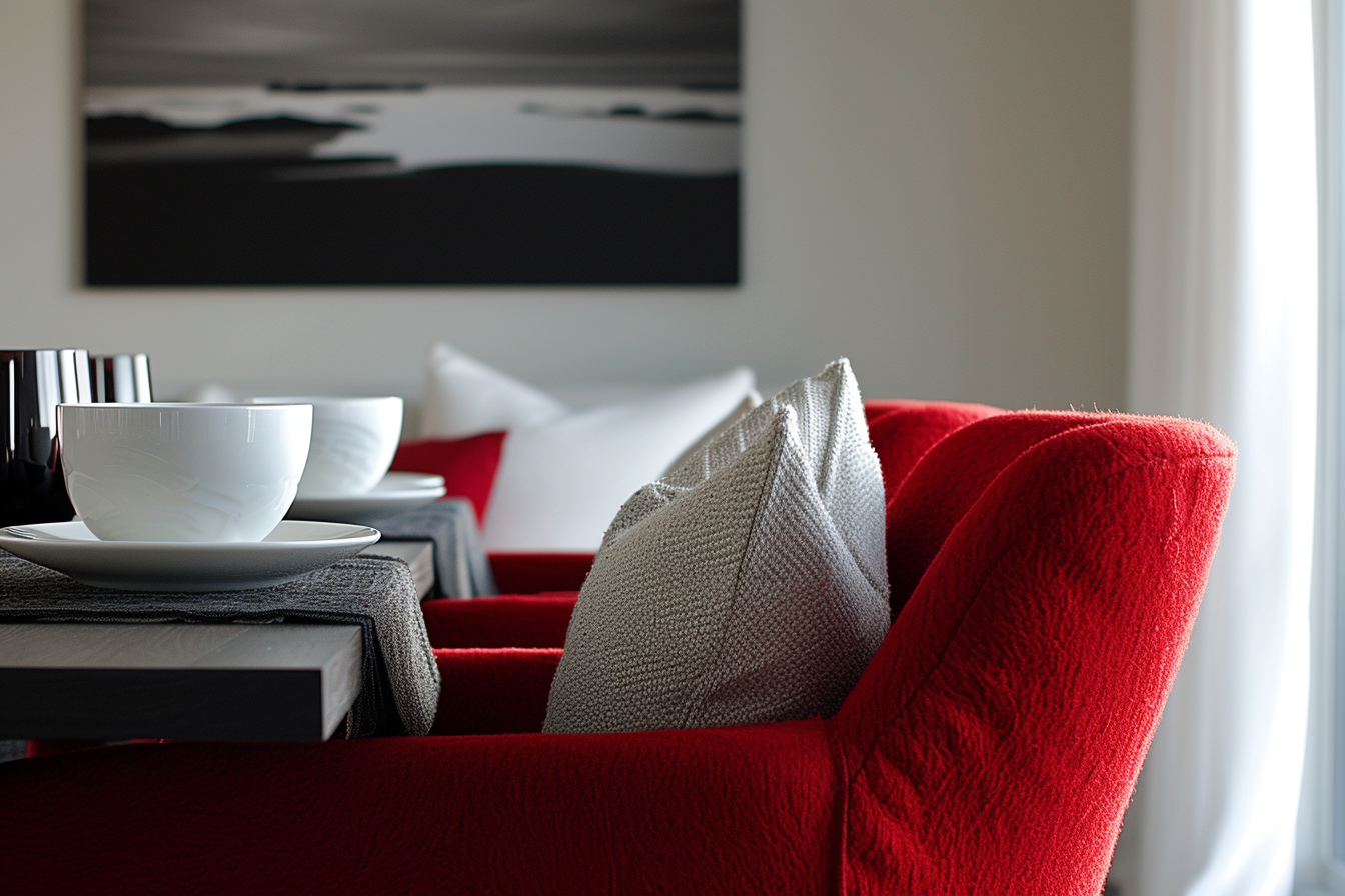
Red, a bold and energetic color, is best used in moderation. It’s great for adding excitement to social areas like dining and living rooms, where its ability to stimulate conversation and energy is a plus. However, in places meant for rest, like bedrooms, it’s wise to limit red. Its stimulating nature might be too much in a space where you’re trying to relax and sleep.
For a softer touch, red can be introduced through small decorations like pillows or art, especially in rooms where you want just a hint of energy without overwhelming the space. In workspaces or study areas, a little bit of red can help maintain focus and creativity.
In businesses like restaurants or stores, red can create a lively and inviting atmosphere. But, it’s important to balance it with calmer colors to avoid making people feel restless. This way, red can enhance the space without overpowering it.
The key with red is to think about what the room is used for and how much energy you want in that space. A little red goes a long way in adding warmth and liveliness.
Orange: Cheerfulness and Comfort
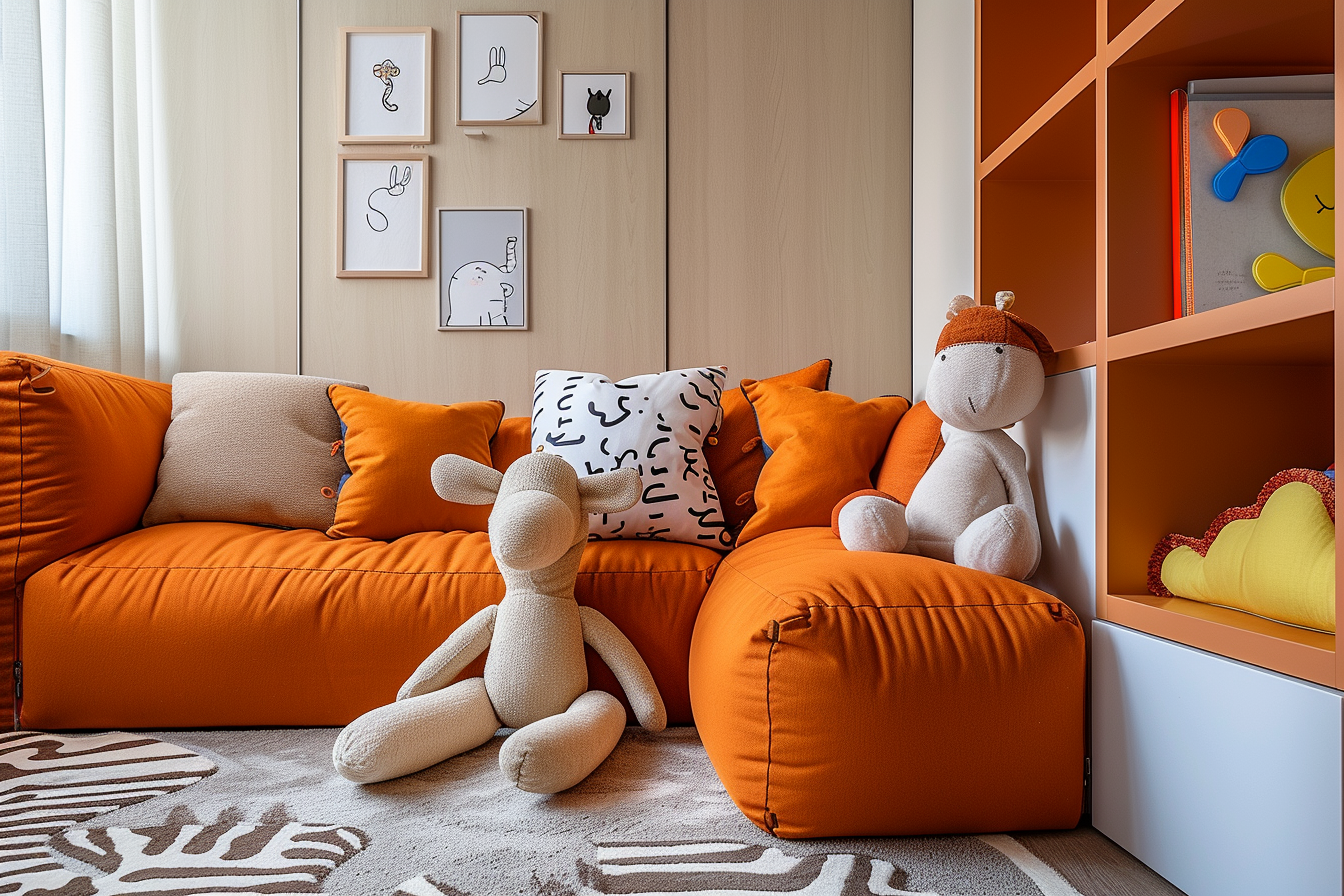
Orange, blending the vitality of red with the cheerfulness of yellow, is a color that radiates warmth and energy. This vibrant hue is frequently linked to joy, sunshine, and the allure of tropical landscapes. It stands out as an uplifting and invigorating color, known for its ability to stimulate feelings of enthusiasm and excitement.
In color psychology, orange is perceived as a sociable and optimistic color, encouraging interpersonal communication and a sense of openness. Its use in social spaces, like living rooms or communal areas, can foster a lively and friendly atmosphere, perfect for encouraging conversations and lively gatherings.
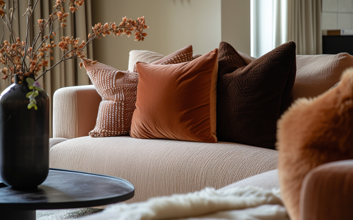
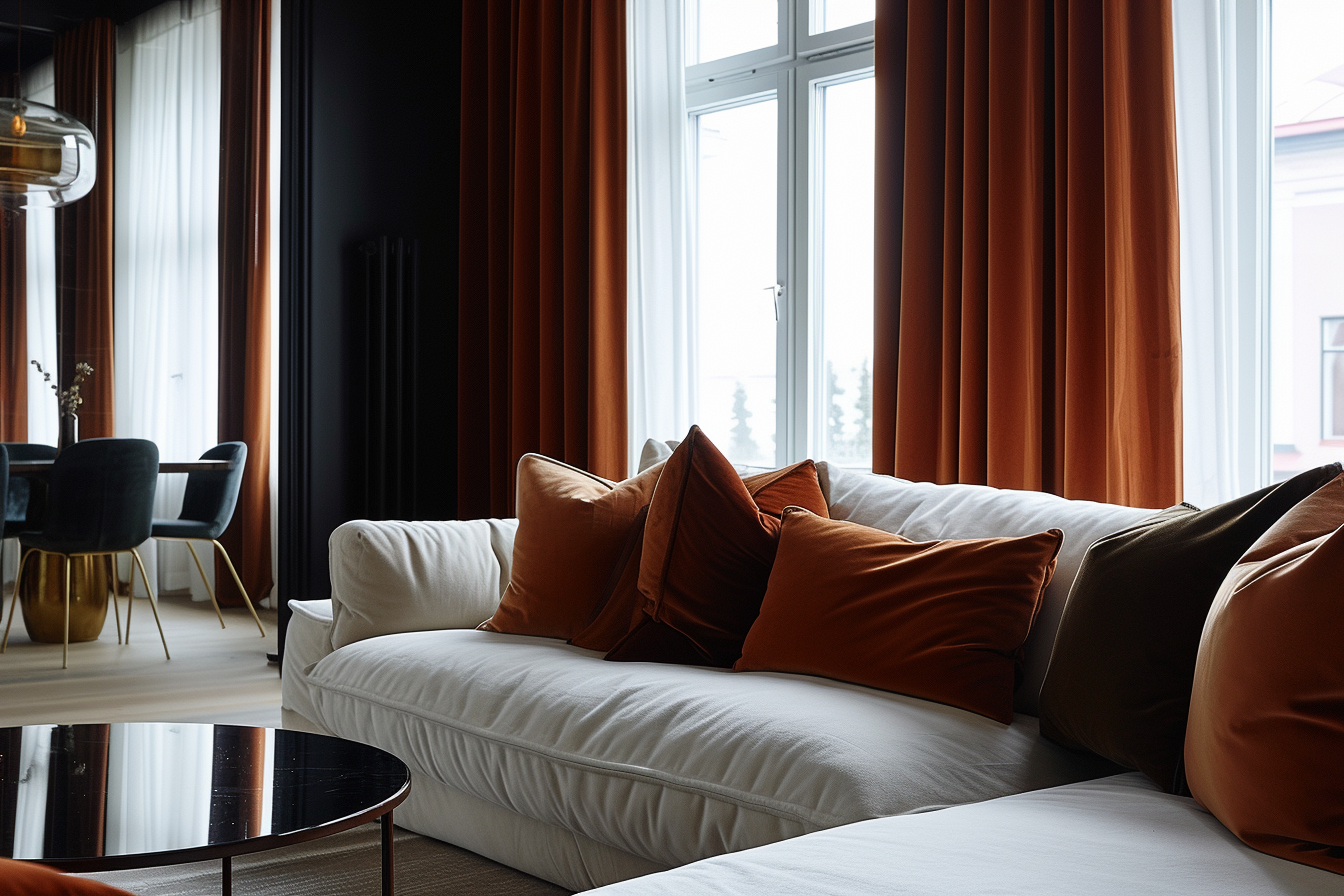
In interior design, orange can be used to create a sense of comfort and warmth. It works well in spaces where creativity and activity are encouraged, such as playrooms, creative studios, or exercise rooms. However, similar to red, it’s important to use orange thoughtfully, as too much can be overwhelming. When used as an accent, perhaps in cushions, wall art, or a single feature wall, orange adds a pop of brightness without dominating the space.
Application in Interiors:
Orange, with its lively and engaging nature, is an excellent choice for spaces where the goal is to stimulate activity and encourage social interaction. Its energetic qualities make it particularly suitable for areas like playrooms and family rooms, where a sense of fun and dynamism is desired. The color helps create an environment that is both welcoming and invigorating, encouraging people to come together and engage.
In such spaces, using softer shades of orange, like peach or terracotta, can be particularly effective. These more subdued tones of orange retain the warmth and friendliness of the hue but do so in a more gentle manner. Peach brings a soft, cheerful ambiance, perfect for creating a soothing yet playful atmosphere. Terracotta, on the other hand, offers a more earthy and grounded feel, which can add a sense of calm and stability to the liveliness typically associated with orange.
In addition to walls and furnishings, orange can be introduced through accessories and decor. Throw pillows, rugs, curtains, and artwork in various shades of orange can add pops of color and warmth to a room. This approach allows for flexibility, as you can easily adjust the amount of orange in the space to suit your taste and the room’s overall design.
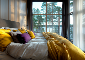
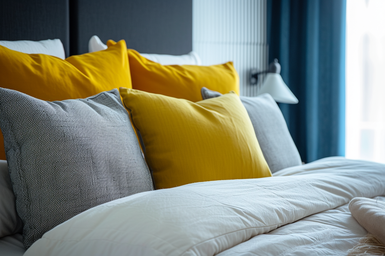
Yellow: Happiness and Brightness
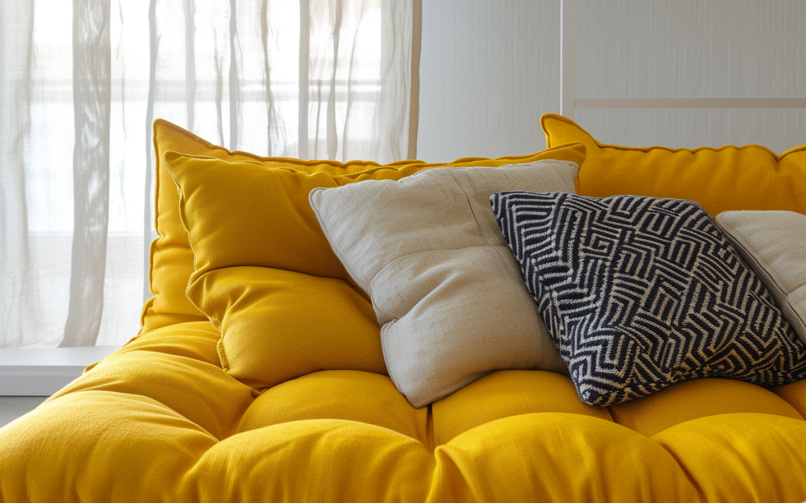
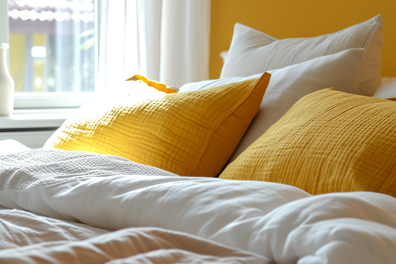
Yellow, recognized as the most luminous and vibrant color visible to the human eye, is widely associated with feelings of happiness, optimism, and enlightenment. This cheerful hue has a unique ability to uplift spirits and boost self-esteem, making it a popular choice in various fields for its positive psychological effects.
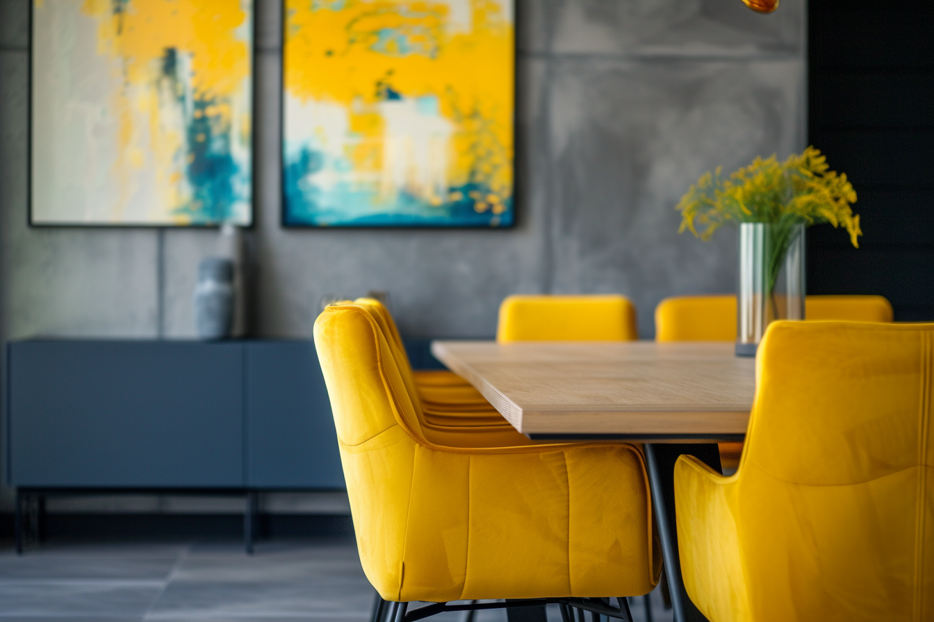
In interior design, yellow is used to create a sense of warmth and brightness in a space. It can make small, dimly lit rooms feel more spacious and illuminated. However, like other strong colors, it’s most effective when used judiciously. Soft yellows can make a room feel cozy and welcoming, while bolder shades can add a lively and energetic touch. It’s particularly effective in spaces like kitchens, bathrooms, or dining areas, where a cheerful and inviting atmosphere is beneficial.
Application in Interiors:
Yellow, with its bright and cheerful aura, is an excellent choice for rooms like kitchens, dining areas, and bedrooms, where its energizing and uplifting qualities can enhance the mood and ambiance. In these spaces, yellow can stimulate a sense of well-being and positivity, making daily routines more enjoyable.
In kitchens, yellow can create a warm and inviting environment. It’s a color that can stimulate the appetite and brighten the room, making it a welcoming space for cooking and gathering. Whether it’s a sunny lemon hue on the walls or mustard yellow accents in the decor, yellow brings a splash of energy and joy to the heart of the home.
Pale yellows are particularly effective in small, dark rooms. These softer shades of yellow have the ability to make such spaces feel more open and airy, counteracting the lack of natural light. This is especially beneficial in areas that do not have large windows or in rooms facing away from the sun. Pale yellow can reflect any available light, creating a sense of spaciousness and brightness.
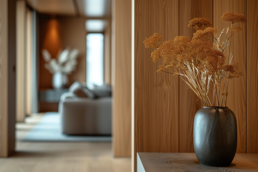
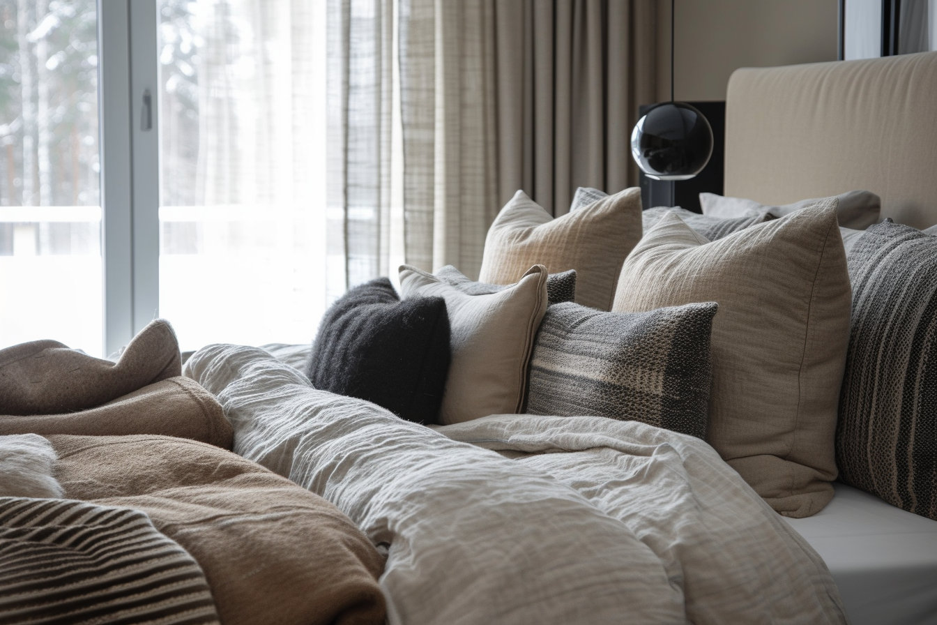
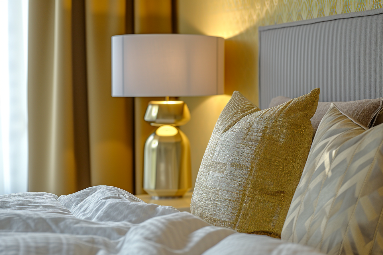
Warm Neutrals: Cozy and Versatile
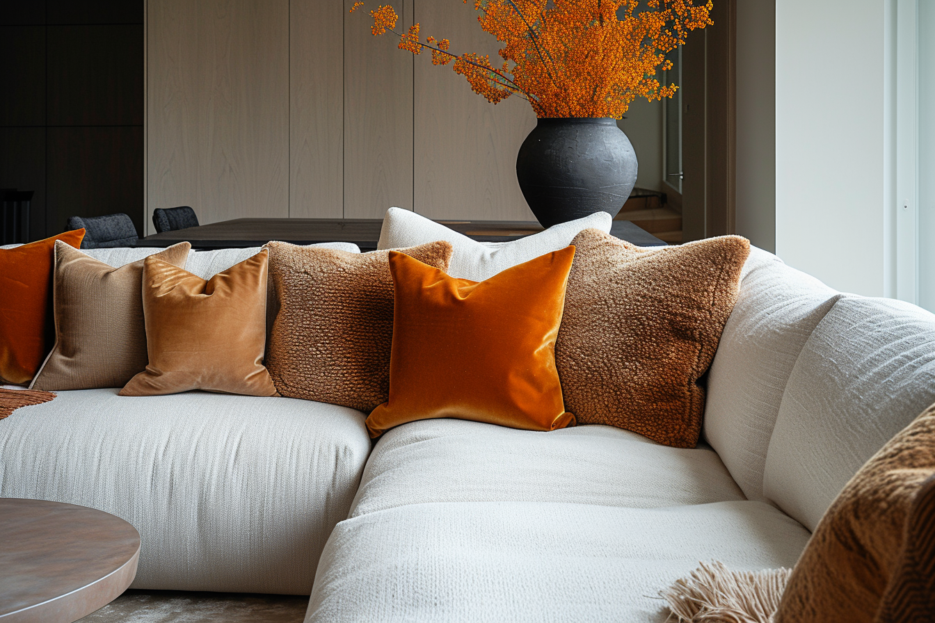
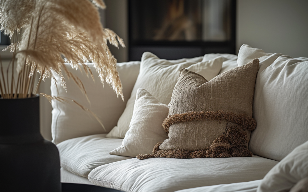
Warm neutrals like cream, beige, and taupe are renowned for their ability to infuse spaces with a sense of calm and stability. These hues, with their understated elegance, are often perceived as cozy and comforting, making them ideal for creating environments that feel welcoming and soothing.
Cream, a soft and light shade, offers a subtle warmth that can brighten up a space while maintaining a relaxed vibe. It works beautifully in rooms that aim for a light and airy feel but still want to avoid the starkness that sometimes comes with pure white.
Beige is another versatile warm neutral that brings a sense of earthiness and natural warmth to interiors. It’s a color that can easily blend with various decor styles, from rustic to modern.
Taupe, a slightly deeper neutral, straddles the line between gray and brown, offering a richness that is both sophisticated and grounding. It’s an excellent choice for spaces where you want to create a feeling of elegance and serenity.
Warm neutrals have the advantage of being incredibly versatile. They can serve as a foundation for a neutral color scheme or act as a balancing element in a more vibrant palette. In addition to their aesthetic appeal, these colors have a timeless quality, ensuring that spaces decorated with these hues remain stylish and relevant over time.
In interior design, warm neutrals are often used to create a sense of continuity and flow throughout a home. By using these colors in different rooms, one can achieve a cohesive look that is both inviting and harmonious. This seamless transition from room to room can make a home feel more spacious and unified.
Application in Interiors:
Warm neutrals, such as cream, beige, and taupe, are exceptionally versatile, serving as a perfect backdrop for a wide range of color schemes. Whether paired with bold, vibrant colors or more subdued hues, these warm neutrals have the unique ability to complement and enhance various design elements, making them ideal for both living rooms and bedrooms where creating a tranquil and serene atmosphere is often a priority.
In spaces that receive plenty of natural light, warm neutrals can work particularly well. The sunlight enhances the warmth and brightness of these colors, creating an inviting and airy feel. In rooms with large windows or ample sunlight, these colors can make the space feel more open and connected to the outdoors. The natural light plays off the subtle undertones in these colors, bringing out their depth and richness.
Furthermore, warm neutrals are an excellent choice for spaces that aim to have a timeless and classic look. Unlike more trendy colors that might feel outdated after a few years, warm neutrals have a staying power in interior design. They can adapt to various styles and preferences, ensuring that the space remains stylish and relevant over time.
Combining Warm Colors with Other Elements:
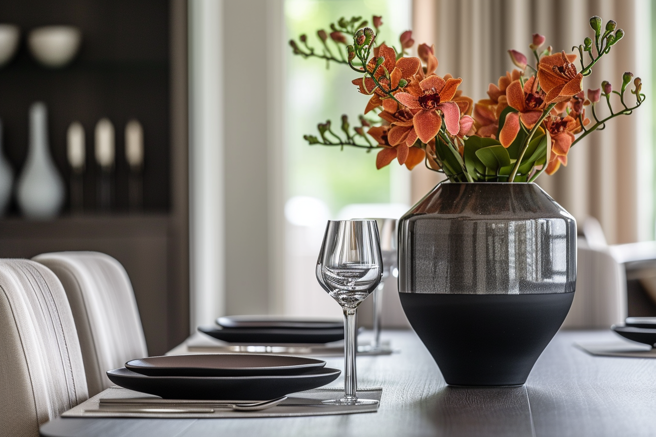
Balancing warm colors with cool tones is an effective way to create a harmonious and visually appealing space. This contrast between warm and cool can bring a sense of balance and dynamism to a room’s aesthetic. For instance, a room that predominantly features warm hues like yellow or orange can be beautifully offset with accents in cool blues or greens. This creates a refreshing contrast that energizes the space while maintaining a cohesive look. The cool tones provide a calming effect, which can be particularly beneficial in spaces that are intended to be vibrant yet relaxing.
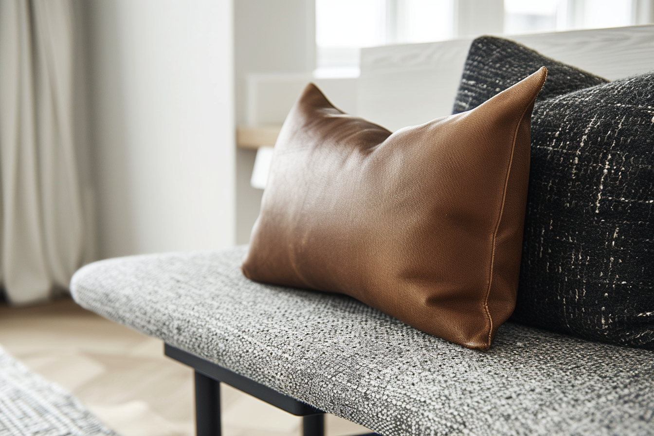
Incorporating textured fabrics like velvet or chenille can further amplify the warmth of a space. These fabrics not only add a tactile dimension to the design but also reflect light differently, adding a subtle visual richness. For example, a velvet sofa or chenille throw pillows in a living room with a warm color scheme can make the space feel more inviting and luxurious. Similarly, heavy draperies in a lush fabric can enhance the warmth of a room, especially in cooler months.
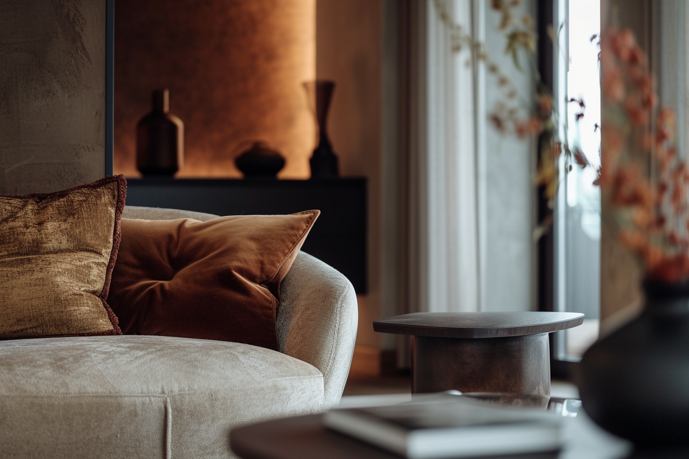
Layering different textures can also create a more dynamic and inviting space. Combining smoother surfaces with more textured elements can add interest and complexity to the room. For instance, a smooth, creamy leather armchair paired with a soft, woolen rug in a beige-toned room can create a sophisticated yet cozy ambiance.
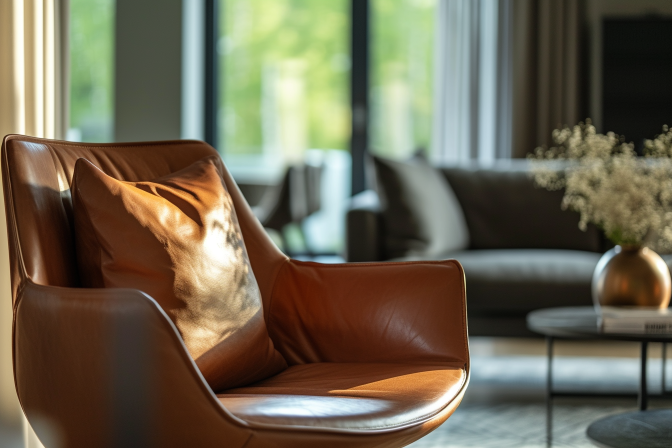
Moreover, warm colors are enhanced when paired with metallic accents like brass, gold, or copper. These metals can introduce a touch of glamour and warmth, especially when used in light fixtures, picture frames, or decorative objects. They reflect light in a way that complements the warmth of the color scheme, adding a hint of luxury to the overall aesthetic.
RELATED: How Different Colors Influence Mood and Ambiance in Your Home
If you want to learn more about the colors in Interior design, buy my book Color theory in interior design from Amazon.