Pre-Fall Color Trends in Interior Design

As we transition from the bright and bold colors of summer into the richer, deeper tones of autumn, pre-fall presents a unique opportunity to refresh home interiors with new color trends. This period is all about embracing the warmth and coziness that the upcoming months promise. Here’s a look at the emerging color trends in interior design for the pre-fall season, offering inspiration to update your space with the latest hues.
Earthy Neutrals
This pre-fall, earthy neutrals continue to dominate, providing a soothing and grounding palette. Think shades of beige, taupe, and warm grays that offer a subtle yet sophisticated backdrop to any interior. These colors work beautifully with natural materials like wood, leather, and stone, enhancing the organic feel of a space. Incorporate these tones through wall colors, large furniture pieces, or textile layers like rugs and throws to create a serene and welcoming environment.

Rich Jewel Tones
As the season shifts, so does our palette preferences, moving towards more saturated and opulent colors. Jewel tones like emerald green, sapphire blue, and amethyst bring a touch of luxury and drama to interiors. These hues pair well with metallic finishes such as brass or gold, adding a regal touch to any room. Use these colors in accent pieces like cushions, curtains, or a feature wall to make a bold statement without overwhelming the space.

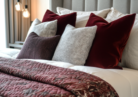
Burnt Oranges and Rusty Reds
Echoing the colors of falling leaves, burnt oranges and rusty reds are perfect for adding warmth to your decor. These vibrant, earth-inspired colors are ideal for textiles and accessories, infusing energy and warmth into a room. They also complement neutral palettes very well, allowing for versatile design changes that can easily adapt as the seasons progress.

Moody Blues and Greys
Reflective of the stormier skies to come, moody blues and greys are excellent for creating a more dramatic and introspective space. These colors can give a room a more sophisticated and mature feel, perfect for dens, home offices, or bedrooms. Pair these shades with plush fabrics like velvet or silk to enhance the luxurious feel of the darker colors.

Soft Pinks and Muted Corals
Soft pinks and muted corals bring a touch of subdued vibrancy to the pre-fall palette. These colors maintain a hint of summer’s fun while toning down to fit the quieter, cooler atmosphere of fall. They work particularly well in spaces that aim to be soothing yet cheerful, such as living rooms or children’s rooms. Combine these with neutral shades or natural textures for a balanced look.

Classic Navy and Deep Indigo
For those who prefer a timeless look, classic navy and deep indigo are always in style. These versatile colors can act as almost-neutrals themselves, providing a deep, rich base that complements a wide range of decorating styles. They are particularly effective in creating a nautical or coastal vibe when paired with crisp whites and sandy beiges.

The pre-fall season is a perfect time to refresh your home’s color scheme. Whether you choose to embrace earthy neutrals, indulge in jewel tones, or experiment with the warmth of autumnal oranges and reds, these trending colors can help you set the tone for the cooler months ahead. Remember, the key to any successful interior design is to make it your own—choose colors that speak to you and adapt them to suit your personal style and space.
To deepen your understanding of crafting unique and personalized spaces, consider acquiring my book, Basics of interior design, available on Amazon. This guide offers a comprehensive exploration of various design principles tailored to distinct environments, providing you with the knowledge and inspiration needed to transform any space. If you want to learn more about the colors in Interior design, buy my book Color theory in interior design from Amazon.